Brand identity and website
Saiokko
Building a content marketing brand with character, clear service journeys and room to grow.
- Year
- 2026
- Industry
- Content marketing
- Focus
- Identity, UX and development
01
Making the offer easier to understand
Saiokko brings together three services that often sit apart. Editorial Strategy establishes what a business should say and who it needs to reach. The Content Engine turns that direction into an ongoing publishing programme. Account Based Marketing applies the same research to specific buyers and accounts.
The website needed to make those distinctions understandable without making the services feel disconnected. Someone arriving with a production problem should be able to find the Content Engine, while someone who needs direction should understand where Editorial Strategy fits. Both need a clear route from the offer to examples of the work and a conversation about their project.
There was also a longer-term requirement. Articles and case studies would become a substantial part of the website, explaining the methods behind the services and giving prospective clients evidence to assess. The design and implementation had to support that growing body of material alongside a distinctive first impression.
02
An identity built around content
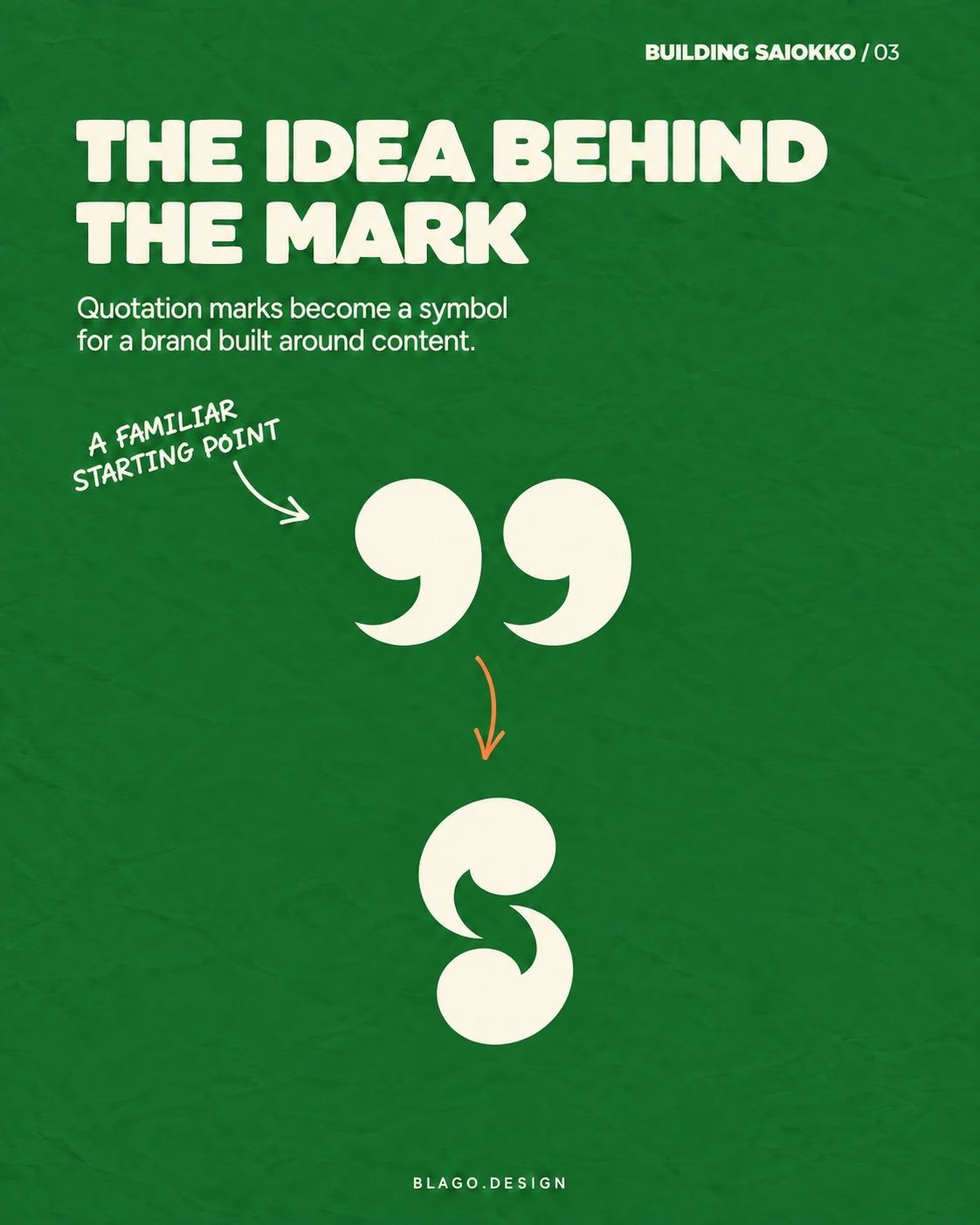
The mark connects quotation marks with an abstract S. It gives the identity a reference to language and content that also works as a standalone symbol. The website's opening animation makes that relationship visible by transforming the quotation marks into the symbol before revealing the wordmark.
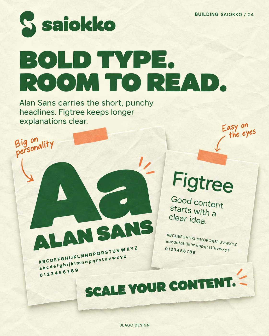
Cream paper and visible folds give the identity a tactile quality. The typography pairs Alan Sans with Figtree: heavy display lettering carries short statements, while quieter headings and body text accommodate longer explanations. That distinction becomes especially useful when moving from a brief service introduction to an article with several sections.
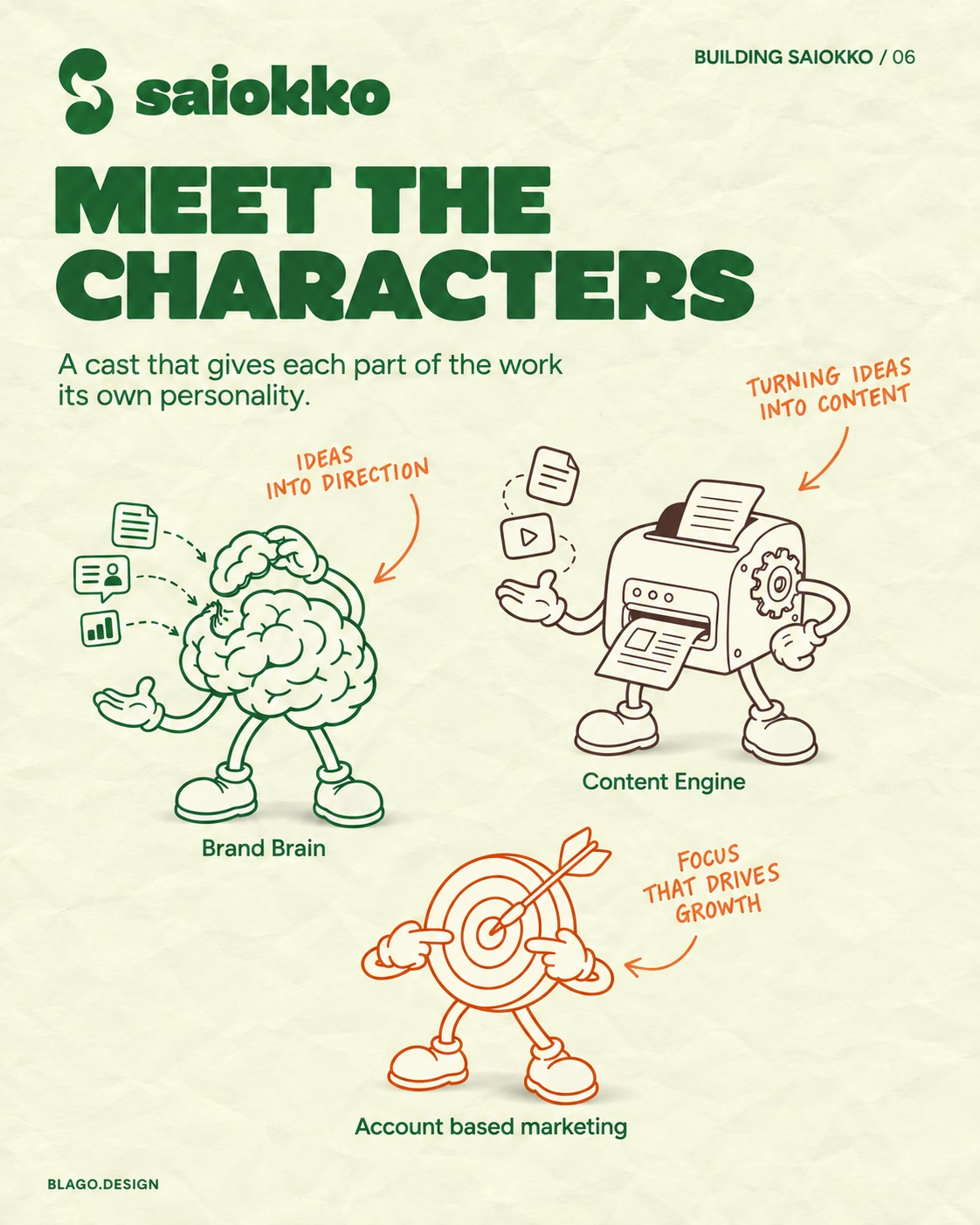
The illustrated characters give each service a recognisable form. The brain represents research and editorial direction, the printing machine represents ongoing production, and the target represents account relevance. Their shared drawing style connects the services, while their different silhouettes make each one identifiable across the website.
03
Colour as part of the website's structure
Colour organises the experience as well as expressing the brand. Each service has an assigned colour, and the supporting content follows the same principle.
These associations repeat through headings, illustrations, backgrounds and interface details. The blue comparison section has a different role from the service introductions, so it receives its own treatment. Case studies and the blog are also distinct destinations, with colours that separate project evidence from editorial guidance.
Cream remains the shared foundation, and orange appears selectively in annotations and smaller accents. Together with the typography and paper texture, those recurring elements hold the different sections within one identity.
Colour is supported by explicit headings, service names and illustrations. Visitors do not have to distinguish a particular shade to understand a section or find the service they need.
Editorial Strategy
Green · #286B35
Content Engine
Brown · #543431
Account Based Marketing
Rust red · #BF3B00
Comparisons
Blue · #34505B
Case studies
Plum · #6E3D58
Blog
Purple · #4F345B
04
Moving from an introduction into the detail
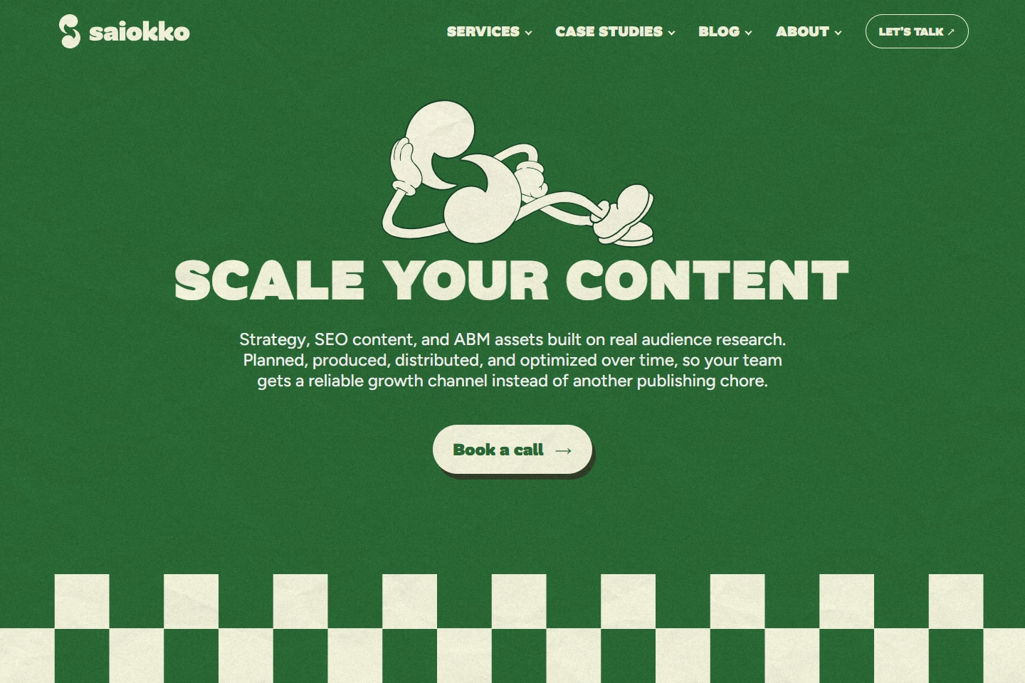
The homepage introduces the business through a sequence of focused sections. Each service has space for its own explanation and character, followed by the approach, project examples and editorial material. Dedicated service pages provide more detail without putting every explanation into the homepage.
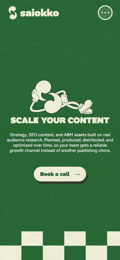
Articles and case studies use a reading layout suited to longer material. Descriptive headings use natural casing and a lighter weight. A table of contents supports movement between sections, and related content provides a route to another article or project. On mobile, the compact contents control identifies the current section while leaving room for the text.
The responsive work considers both reading and recognition. Section headings follow a consistent rhythm, while the main hero retains its prominence. Thumbnails align with their card copy, illustrations retain their proportions, and longer titles can wrap without taking over the screen. The aim is to carry the identity into smaller layouts while keeping the content comfortable to use.
05
Building for a growing body of content
The site uses Astro to generate static HTML before deployment to Cloudflare Pages. This fits a website where much of the experience consists of reading service information, articles and project stories. The content arrives as page markup, with JavaScript used for behaviours such as navigation, section changes and animation.
Articles and case studies share a typed content structure containing titles, summaries, authors, dates, artwork and chapters. Chapters can include references, tables and supporting examples. Shared templates turn that material into listings, cards and reading pages, so adding a publication does not require designing a new page from scratch.
The current publishing workflow keeps that content in TypeScript files and rebuilds the site when it changes. Sanity schemas have been prepared for a future editing workflow, but the CMS is not connected to the rendered publications. This separates the structure already delivered from the next stage of making publishing easier for editors.
The implementation also includes reusable navigation and publication components, locally hosted fonts, AVIF publication artwork, page metadata, canonical links, structured data and a sitemap. These provide a consistent foundation as the library grows. A larger editorial operation will also need a verified preview, review and publishing workflow, with navigation and build times reviewed as the volume increases.
06
Keeping the visual character within a loading budget
The animation and illustration work introduced a practical constraint. Some mascot exports contained large amounts of embedded artwork and animation data, increasing the initial page payload. The optimisation work separated bitmap resources into cacheable files, deferred animation data until the relevant section opened and paused inactive animations.
The recorded homepage HTML size fell from approximately 1,199 KB to 147 KB uncompressed, an 88% reduction. In the same development review, the mobile Lighthouse performance score improved from 69 to 88, and largest contentful paint improved from 5.9 to 3.8 seconds. The blog listing scored 93.
Those figures come from local production-build tests on 12 September 2026. They document the effect of that optimisation work, rather than current production performance. The full-screen introduction remained a loading tradeoff, and its timing still contributed to the homepage's largest contentful paint. Retesting the deployed website and collecting real-user measurements are the next steps for assessing how it performs across devices and connections.
88%
Less homepage HTML
69 → 88
Mobile Lighthouse performance
5.9s → 3.8s
Largest contentful paint
Historical local production-build measurements, 12 September 2026. These are not current live-site or real-user scores.
07
Making the interaction adaptable
The accessibility work addressed how the site behaves as well as how it looks. Navigation supports keyboard use and focus restoration. Reduced-motion preferences receive a simpler stacked homepage and reduced animation. The underlying service content remains available without JavaScript.
Contrast was reviewed alongside the colour system. The ABM colour was darkened to improve text contrast, while headings and labels continue to communicate the meaning carried by each theme. Reflow, enlarged text, increased text spacing and forced-colour presentations were also checked during development.
The September 12 review recorded no detected automated WCAG A/AA rule violations across 15 sampled page and interface states. It also documented browser checks for navigation, reading controls and mobile layouts. That is scoped test evidence, not a claim of complete accessibility: screen-reader sessions and physical-device testing remain necessary parts of the evaluation.
08
A foundation for the business to build on
The delivered website gives Saiokko a recognisable identity, distinct service destinations and shared layouts for publishing articles and case studies. The colour system connects the brand to navigation, the characters make the services identifiable, and the content structure provides room to explain the work in depth.
The project also established a technical foundation that can be refined as publishing becomes more frequent. Its next stage is to complete the editorial workflow and evaluate the live experience with production measurements and further accessibility testing. Commercial results will need to be assessed through actual enquiry, engagement and sales data as the website is used.