Case study
piktech
A shield-and-wave mark and a Framer site for a software consultancy, built to make the first call feel like the obvious next step.
- Role
- Brand identity, website
- Year
- 2025
- Scope
- Logo, Framer site
- Industry
- Software consultancy
01The client
A software consultancy built on senior engineers
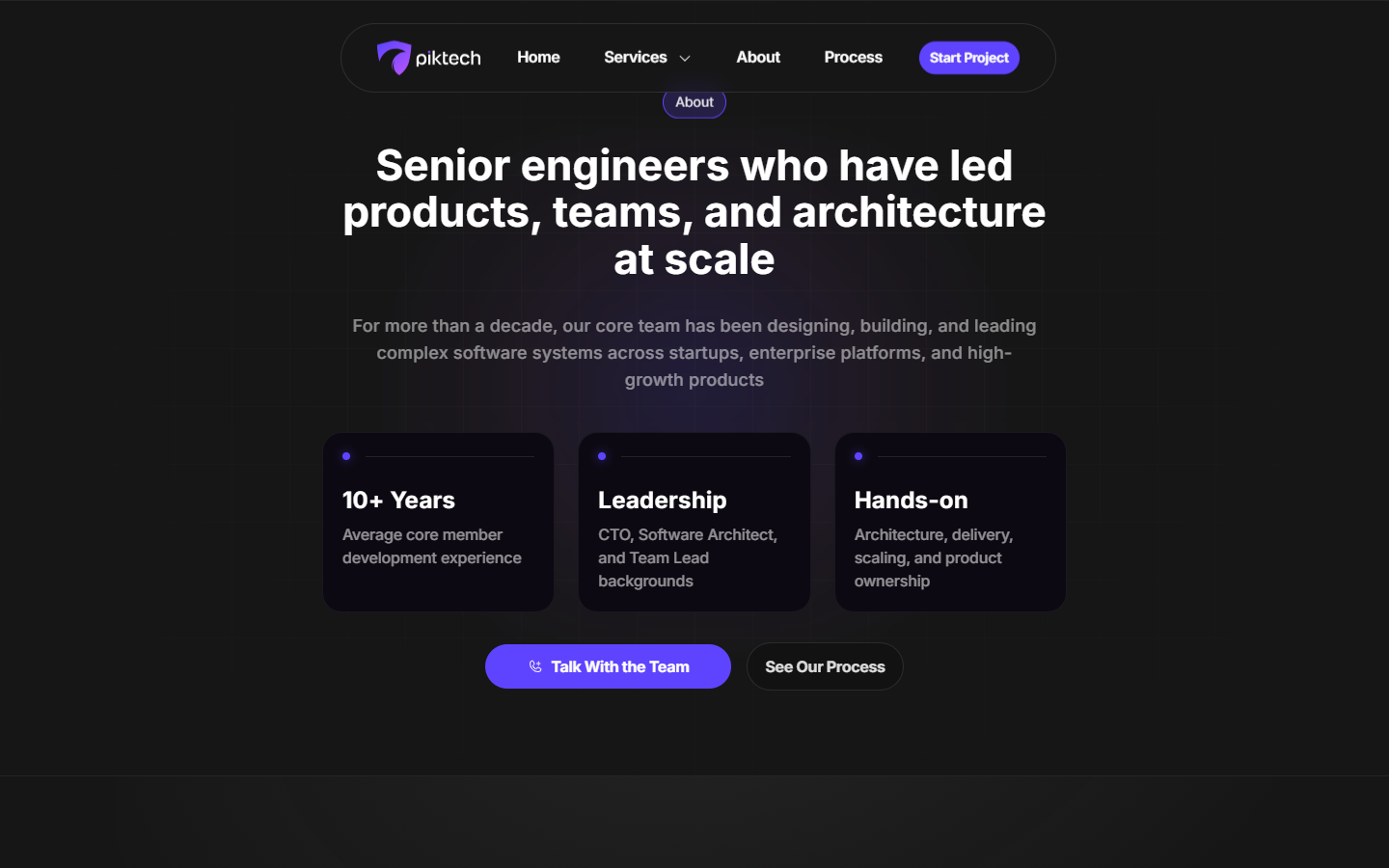
piktech is a small consultancy based in Sofia, Bulgaria. They ship production-ready software for teams that need to move fast, and their pitch is blunt: senior engineers, no long-term hiring risk, people who have done this before.
We came in for two pieces, the mark and the site. Different projects on different timelines, but the same studio behind both.
02Research
A shield, a wave, one mark
The brief was specific from day one. The client wanted a mark that reads as both a shield and a sea wave, protection and momentum in a single shape.
We built it around one continuous swept form, an outline that guards from one angle and unfurls like a wave from the other, with a single gradient carrying both readings.
03The brief
A site that earns the first call
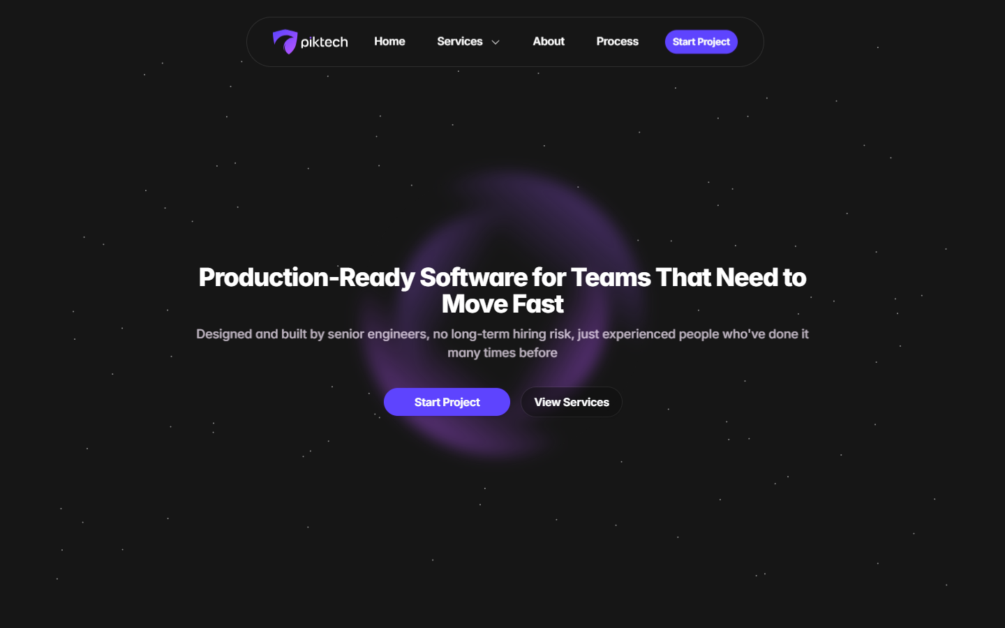
There is no sales team behind this page, so the page has to do the convincing on its own. It had to state the offer in one line, back it with real credentials, and make booking a call the obvious next step.
We built it in Framer, set entirely in Inter, dark and quiet with one accent color doing the work.
Logo
How the mark came together
Inspiration
We started from two references, a sea wave and a shield, and built the shape inside a simple perspective grid so the proportions would hold at any size. The same gradient carries the shield and the dot on the i.
Applied
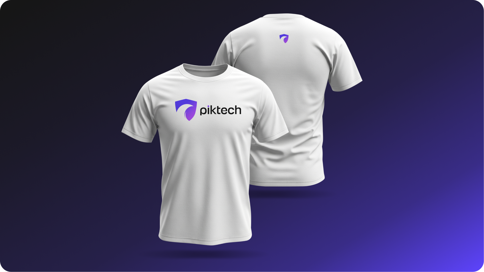
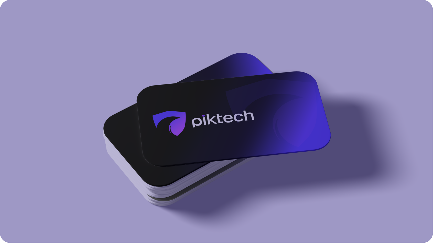
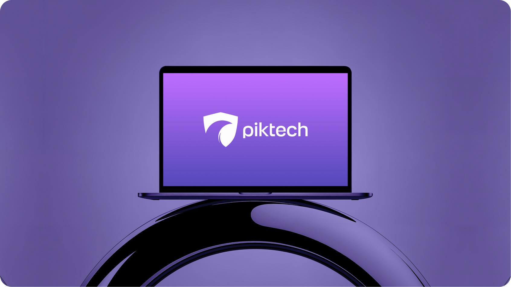
The mark, out in the world

Color
One gradient, on dark
Typography
One family, the full range
Inter
Interface, body, UI
Full variable range
Set across the site and every piece of product UI.
Aa Bb Cc
ABCDEFGHIJKLM NOPQRSTUVWXYZ abcdefghijklm nopqrstuvwxyz 0123456789
Mockups
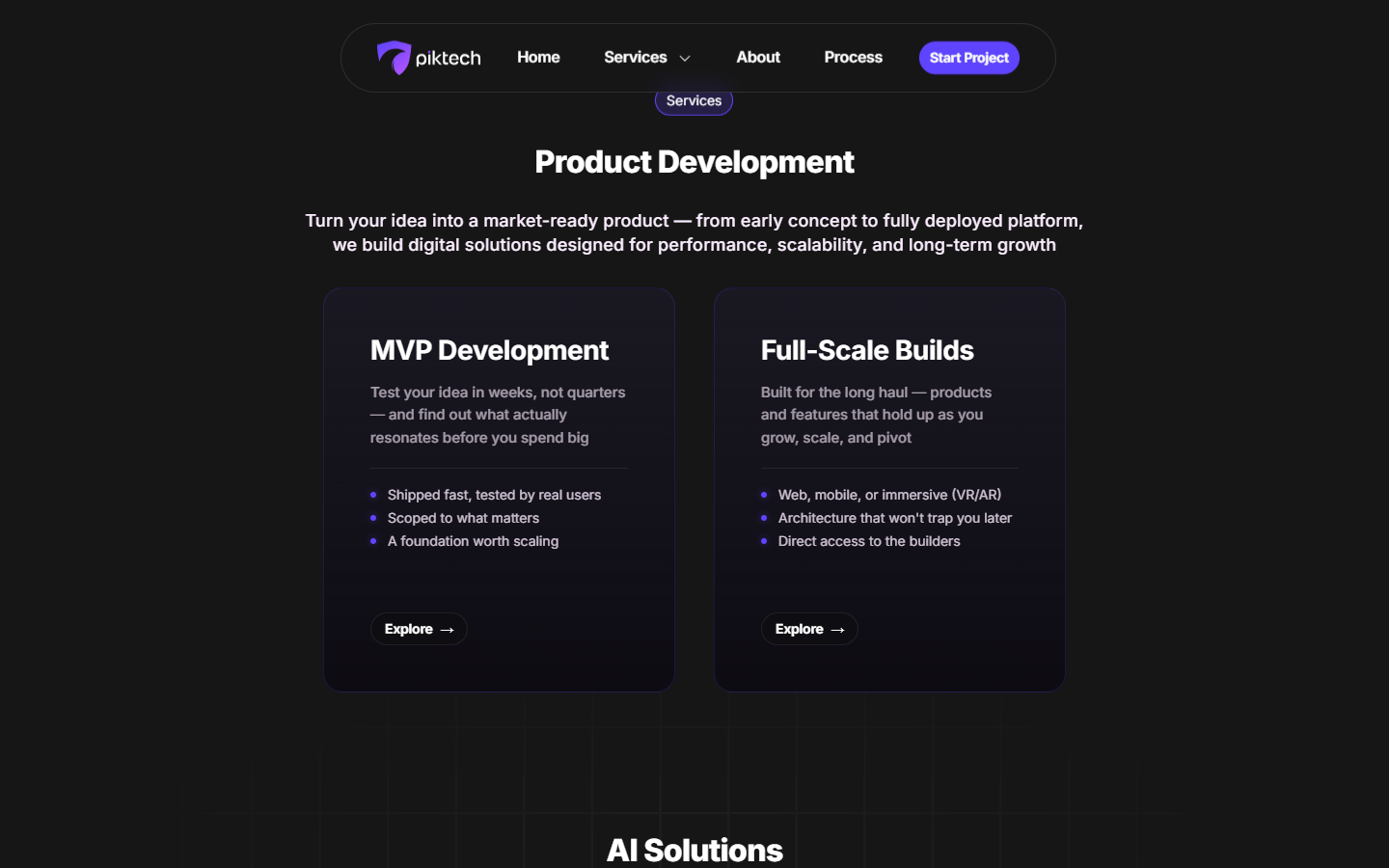
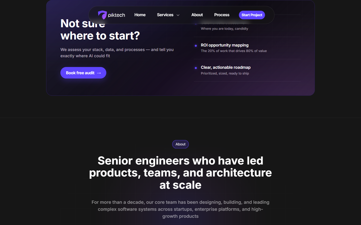
The site, section by section
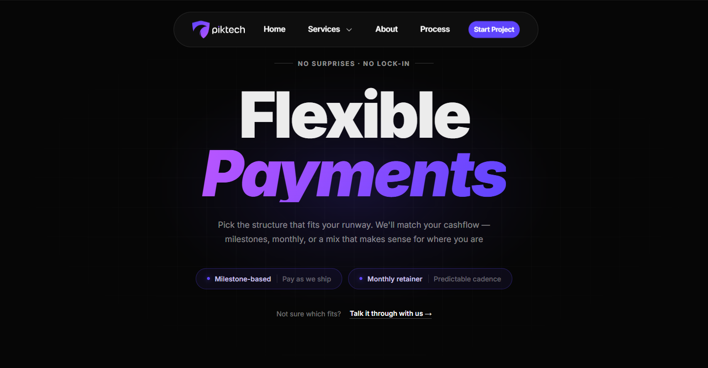
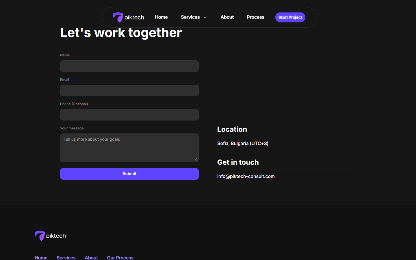
Design system
The system behind the site
The client’s own gradient carries the whole interface: one primary button style, one accent on dark, applied the same way from the nav pill to the contact form.
Primary button
Nav pill
Milestone chip
Input field
Gradient token
Step marker
The website
What makes the site work
A hero that states the offer
One headline, one subline, two buttons. No scroll needed to know what piktech does or who it is for.
Two tracks, not one generic pitch
MVP or full-scale build, laid out side by side so a visitor can place themselves in the first ten seconds.
Flexible payments, said plainly
The one place color and scale both spike. Milestone-based or a monthly retainer, no fine print required to understand it.
A process you can actually see
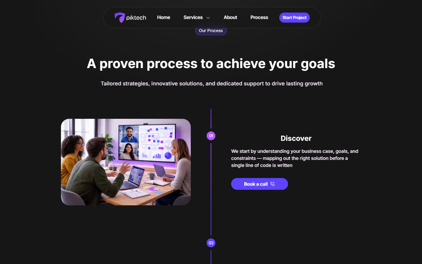
Discover, build, deliver, each step numbered and paired with a real photo, not a stock icon set.
In the end
A mark and a page that both move fast.
A shield that reads as a wave, and a site that gets out of its own way. Different scope from our own site, same bar we hold for every brand we build.