Case study
namics
A brand, a voice, and a website for a startup that turns dry enterprise training into a game worth playing. The site does not describe the product. It is the product.
- Role
- Brand, voice, website
- Year
- 2026
- Scope
- Logo, voice, site, live demo
- Industry
- Learning and enablement
01The client
Training people will actually finish
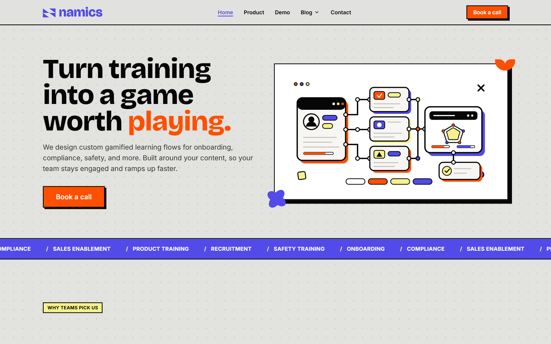
namics turns a company’s own training into a game. Onboarding, compliance, safety, sales enablement, they take the material a team already has and rebuild it as missions, with XP, streaks, and real job scenarios instead of slides and a quiz.
The pitch is sharp: less box-ticking, more real learning. At the end you see readiness, who can actually do the job, not just who clicked through.
02The name and the mark
A bolt built into the N
namics is short for dynamics, so the mark had to carry a sense of energy in motion. We built the logo from four arrow forms that lock together into an N, and left a lightning bolt in the negative space between them.
One shape, two readings: the letter and the charge. It works in a single flat color, holds up small, and gives the whole brand its spark.
03The brief
Loud enough to feel like the product
The site had to feel like the thing it sells: playful, bold, a little loud, but still solid enough for an enterprise buyer. We went neo-brutalist, hard black borders, flat color, thick drop shadows, one big idea per screen.
Every section states a single claim and gets out of the way. One action runs through the whole page: book a call.
Logo
How the mark came together
namics // from dynamics
Four arrow forms fly in and lock into the N. The gap they leave is a lightning bolt, the charge in dynamics, hidden in plain sight. The wordmark is set in the same weight it runs everywhere else.
Color
Loud on purpose
Typography
Bricolage and Inter
Bricolage Grotesque
Display, headlines
Extrabold 800
Every headline, tight and loud.
Aa Bb Cc
ABCDEFGHIJKLM NOPQRSTUVWXYZ abcdefghijklm nopqrstuvwxyz 0123456789
Inter
Body, UI
Regular to semibold
Everything you read and click.
Aa Bb Cc
ABCDEFGHIJKLM NOPQRSTUVWXYZ abcdefghijklm nopqrstuvwxyz 0123456789
The voice
How the brand sounds
namics has to talk to two people in the same breath. A learner who will close the tab the moment it feels like homework, and a buyer signing off on compliance training for four hundred staff. The voice is built to hold both: light enough to keep someone playing, straight enough to trust with onboarding.
Direct, not blunt.
Short sentences, plain words, the point up front. Getting there fast is not the same as being cold about it.
Playful, not silly.
The product is a game. The stakes are somebody’s job. The voice keeps both true at the same time.
Concrete, not corporate.
Name what happens. People finish the training, managers see who is stuck. Numbers instead of adjectives.
Confident, not boastful.
Say what the product does, then hand over the demo and let it prove the claim.
The voice in three moments
On the homepage
Training your team will actually finish.
When you answer wrong
Not quite. Support owns the first response, so the ticket lands with them.
To an enterprise buyer
You will see completion, and you will see who can do the job. Those are two different numbers.
Marketing, in-game feedback, and a sales conversation are three different rooms. The brand sounds like the same person in all of them.
The website
The site had two jobs
The brief asked for one site that does two things at once: sell namics, and be namics. Most product sites reach for a video or a screenshot carousel. This one ships the real thing instead.
A visitor can play the actual game in the browser, and a trainer can build their own training and watch it become a game in about two minutes. The marketing site and the product demo are the same build.
The marketing site
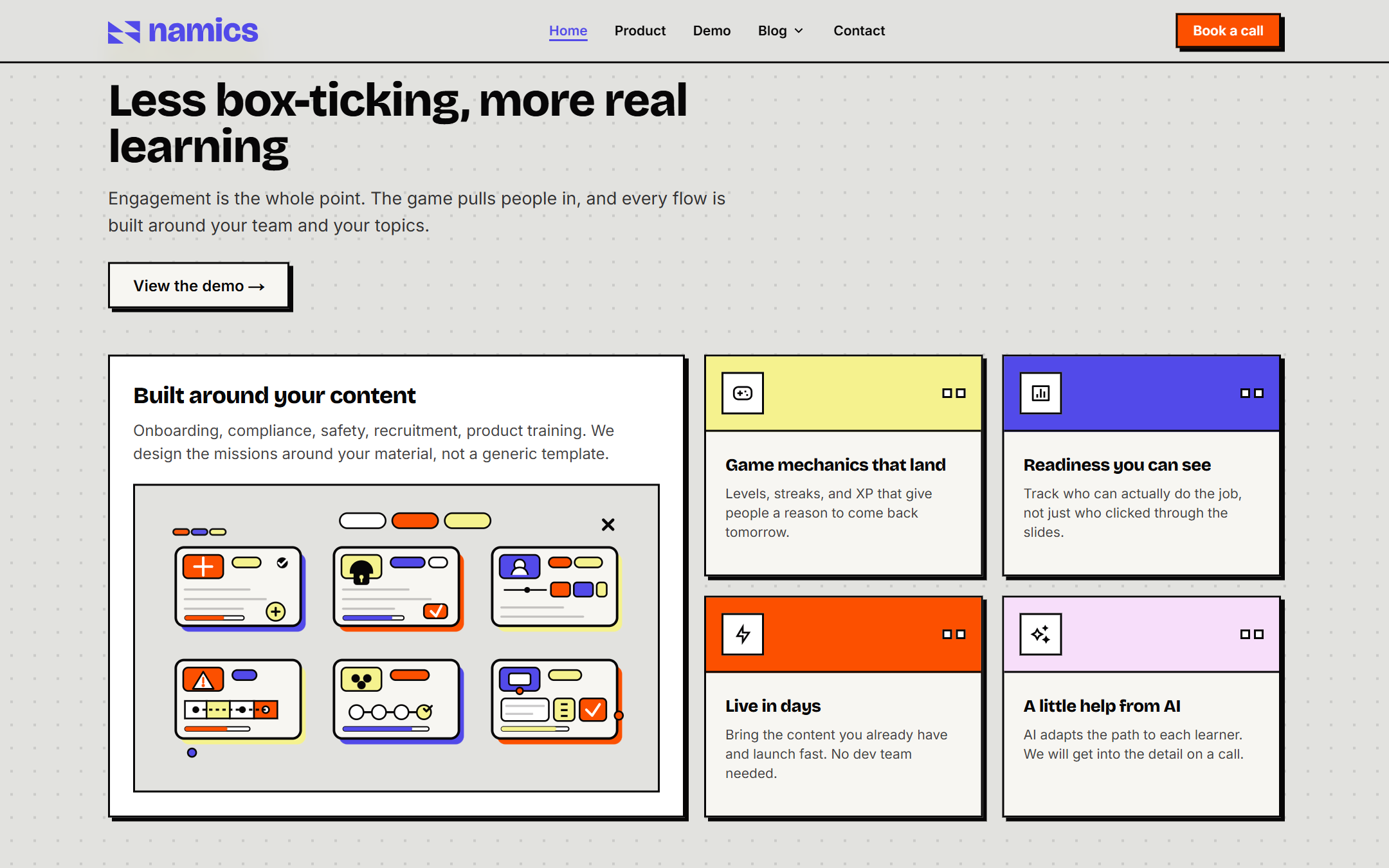
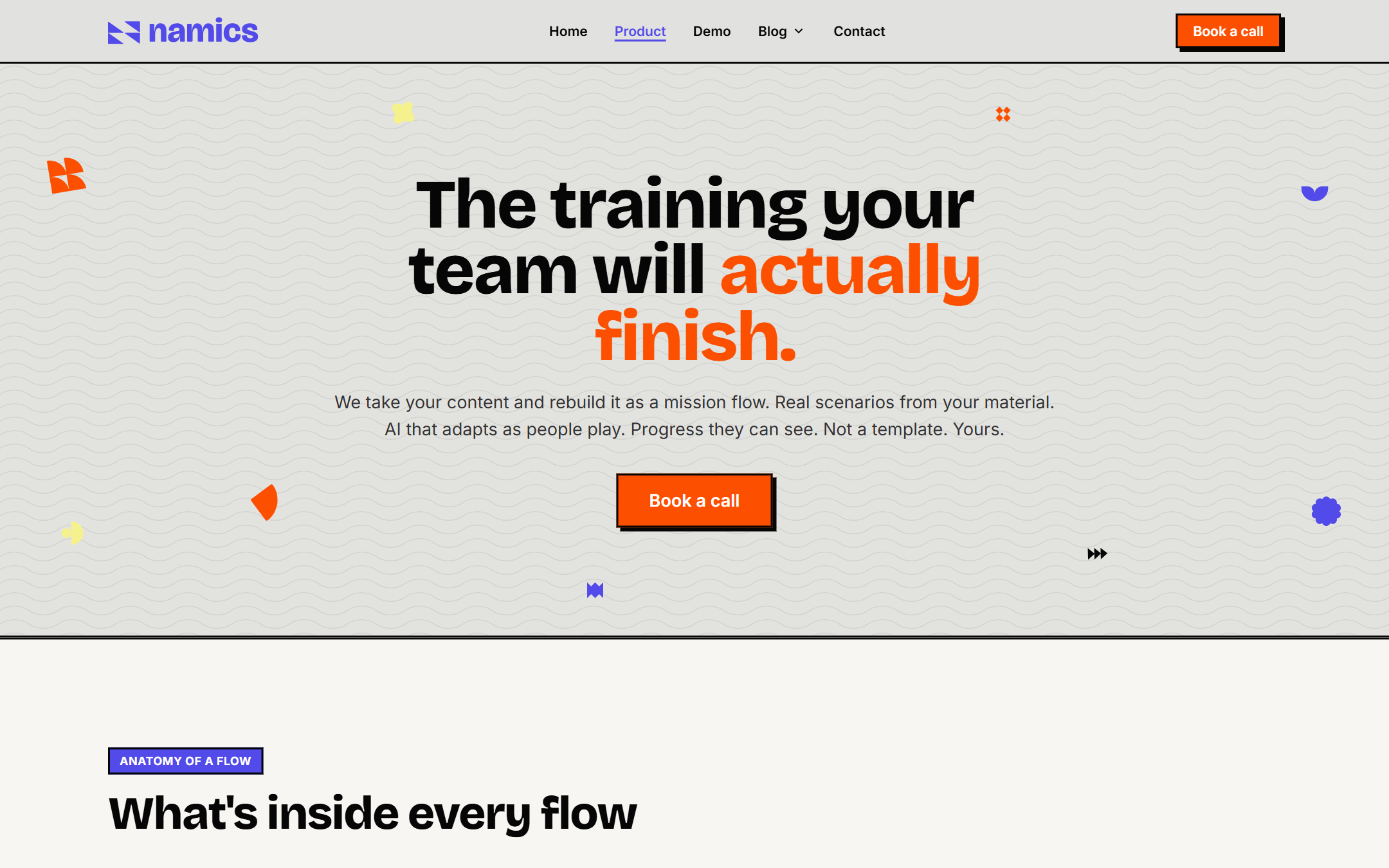
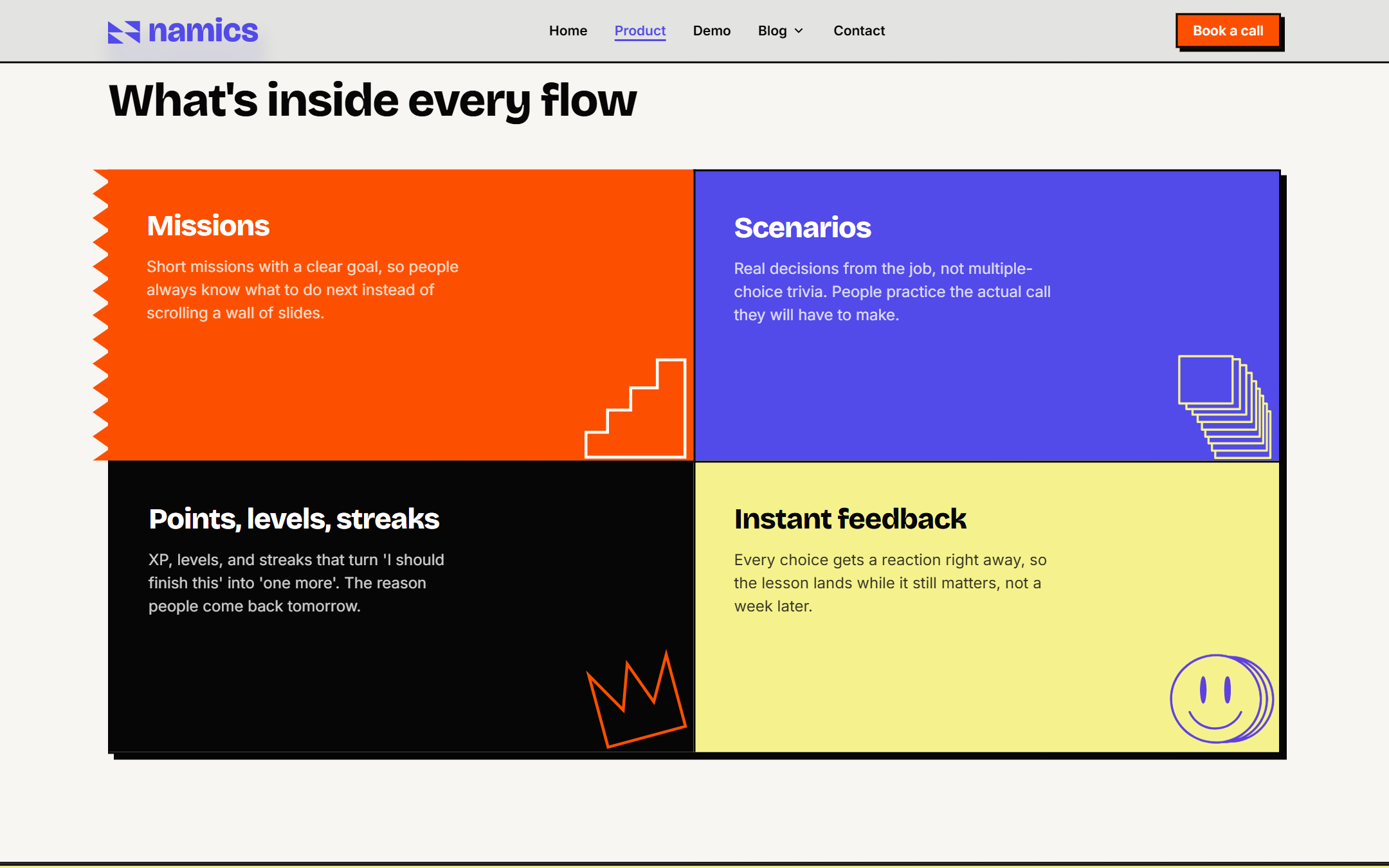
Section by section
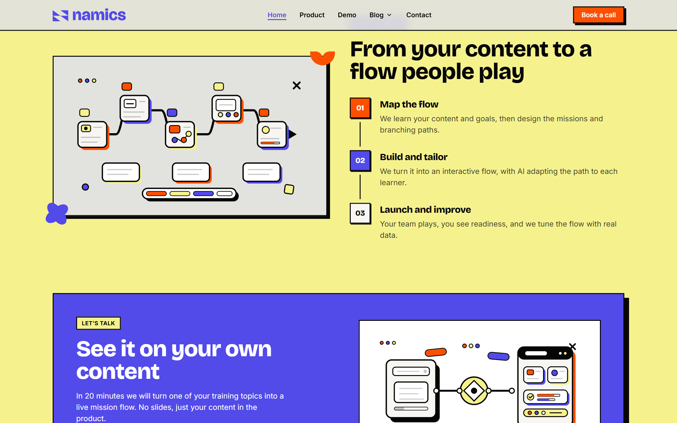
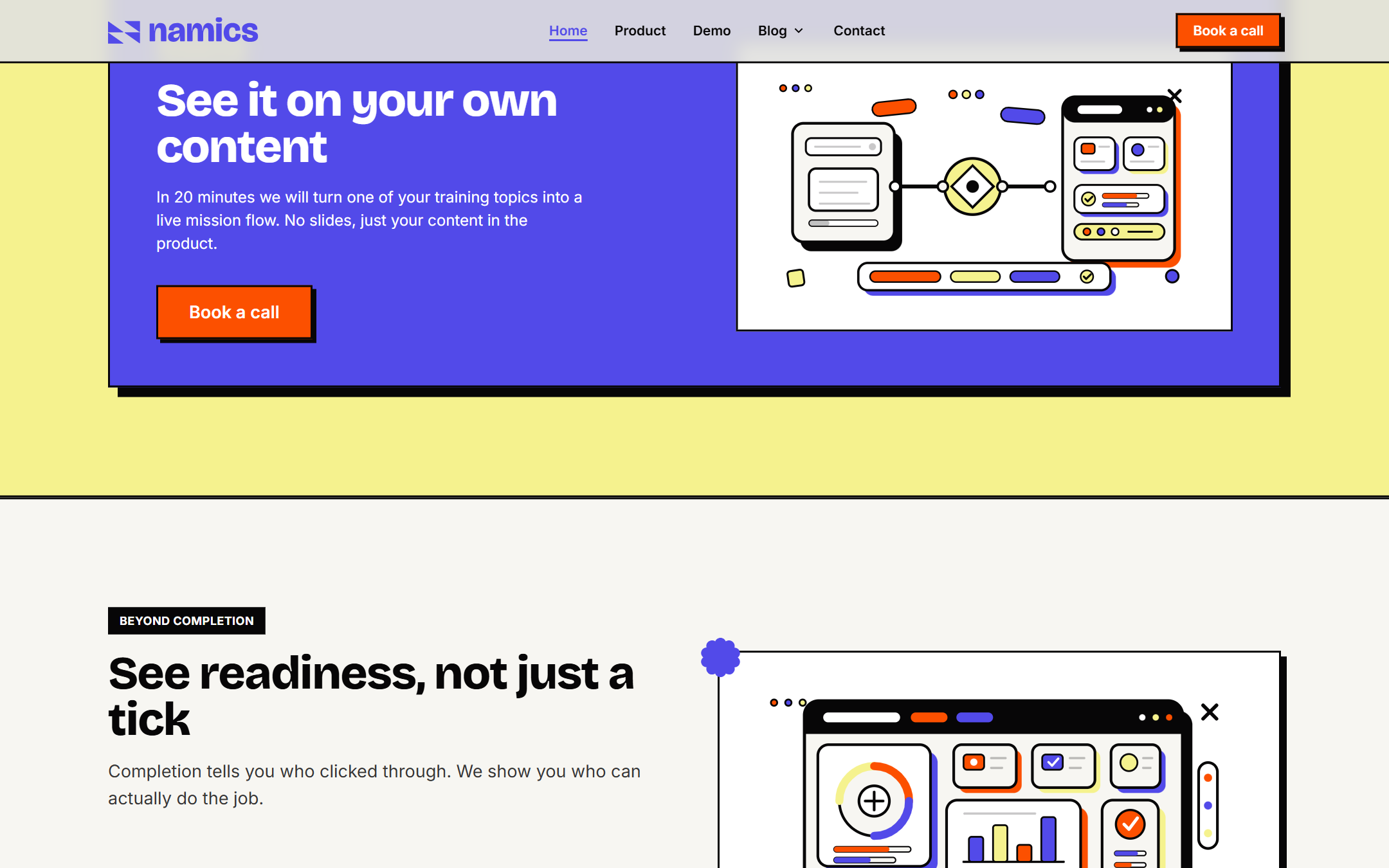
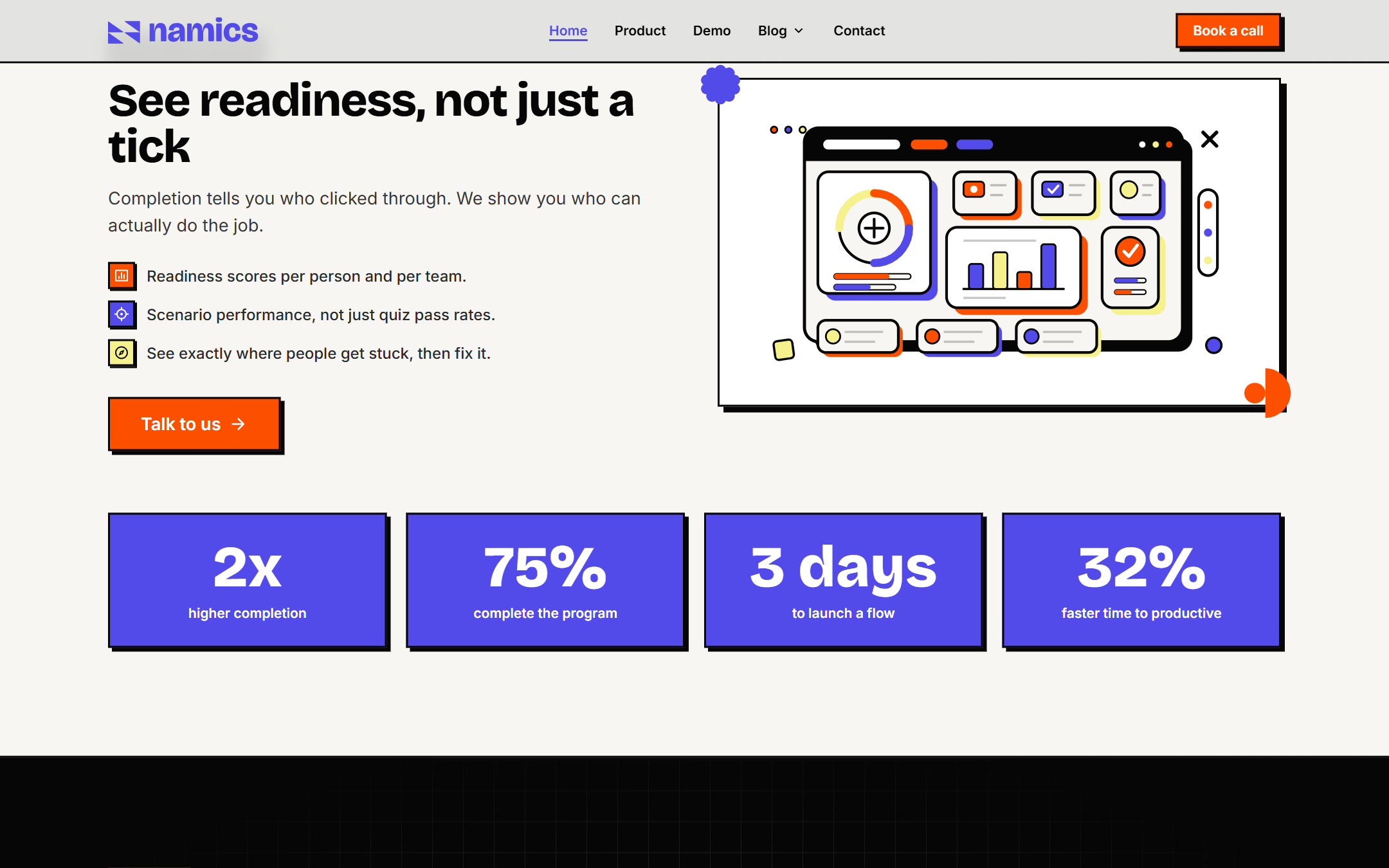
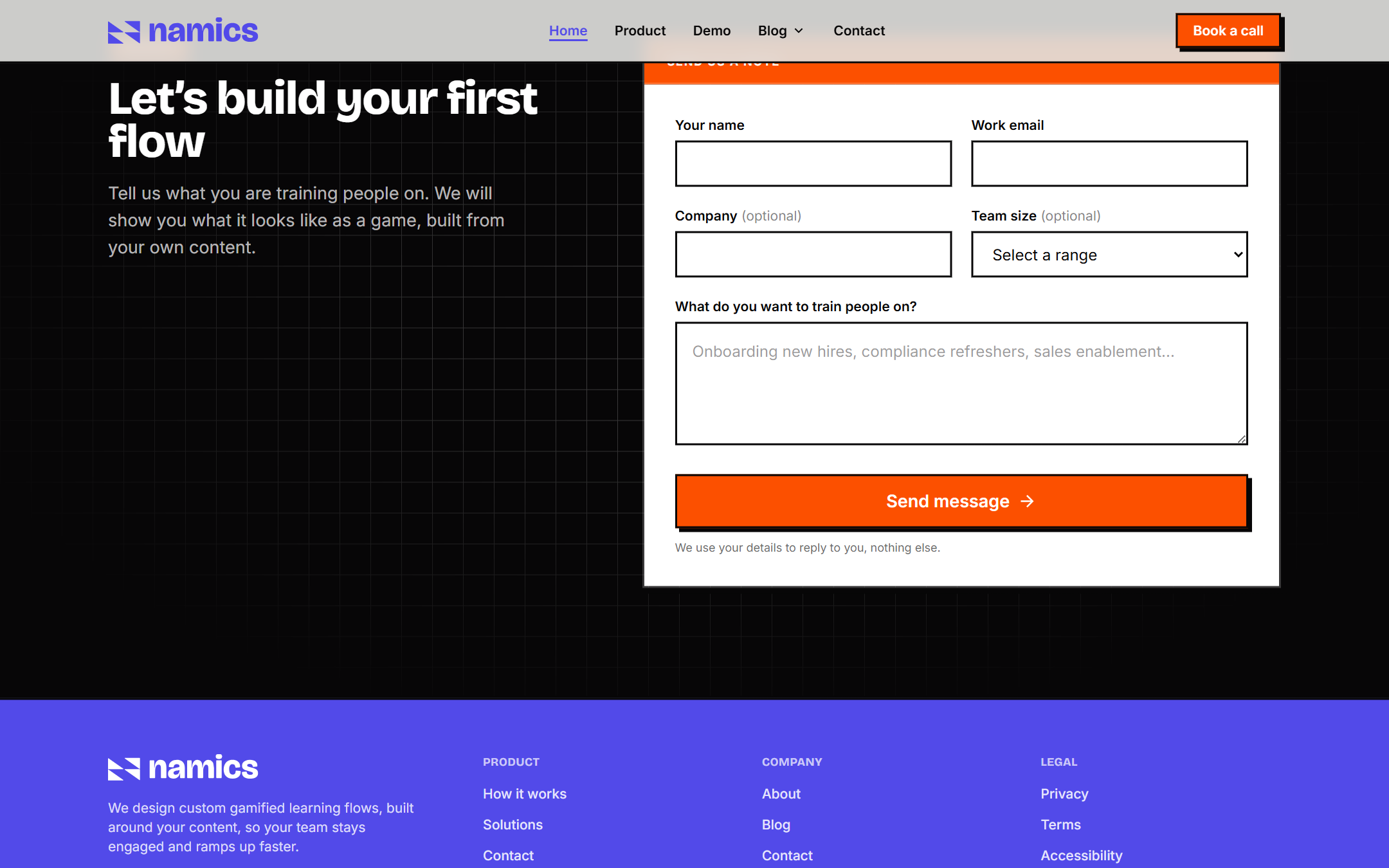
The demo
The site is the product
Instead of a screenshot carousel, the site runs a real game engine. One engine reads a simple config and renders four completely different games. The questions stay the same. Only the frame around them changes.
So a prospect does not watch a preview, they play the thing. Here is what is live on the page, all running in the browser from a static render.
Four ways to play
One engine, four games
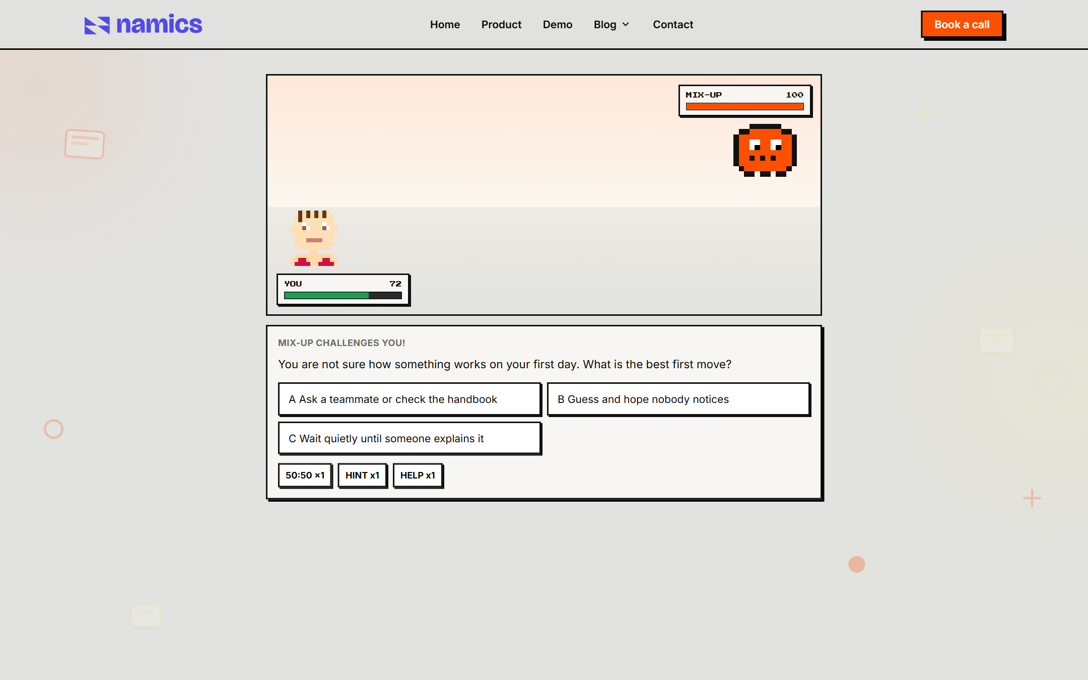
The Shift: onboarding as a boss fight
The strongest piece of the build. Support tickets are your missions, the enemy asks the question, and your answers are moves. A wrong one dents your Data Integrity meter, combos earn power-ups, and a boss closes the week. Get knocked out and you revive at half health, because punishing a wrong training answer is the wrong lesson.
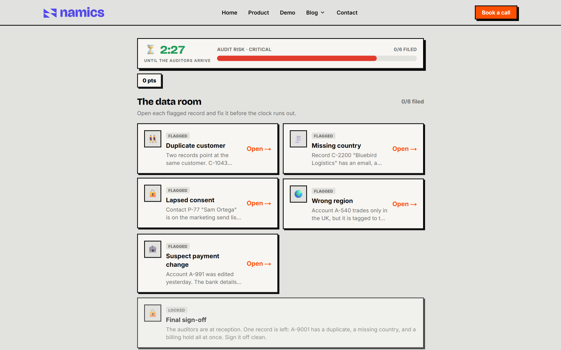
Escape the Audit: beat the clock
Same questions, pure pressure. A board of flagged records, a falling timer, and auditors on the way. Open each fault, fix it, and watch the risk meter drop. A wrong call costs you time.
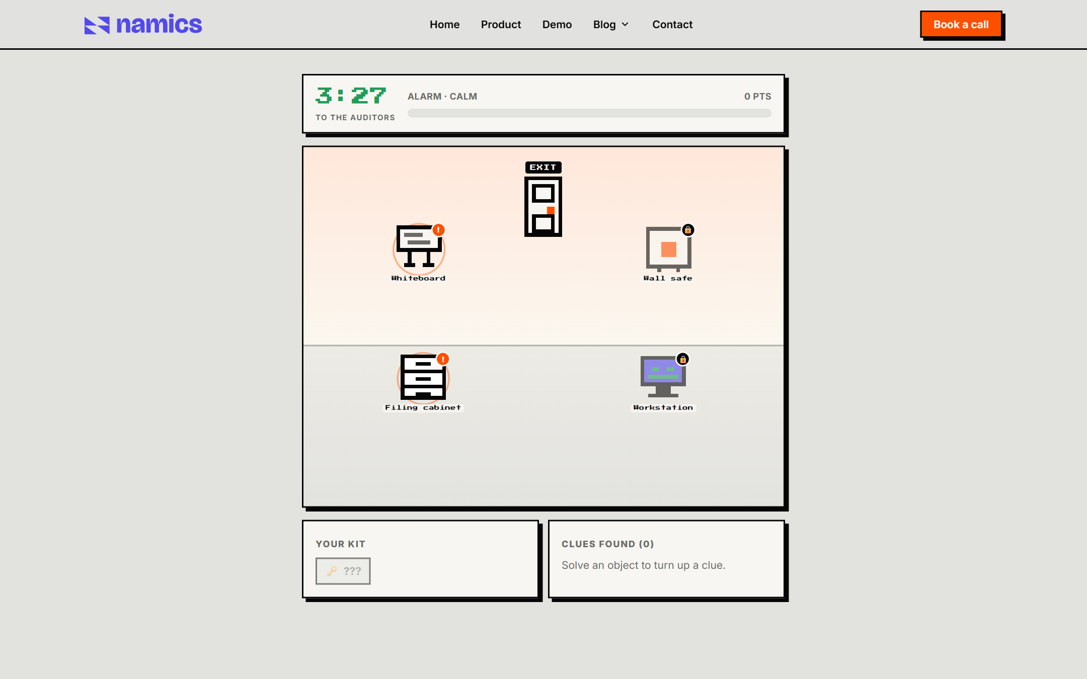
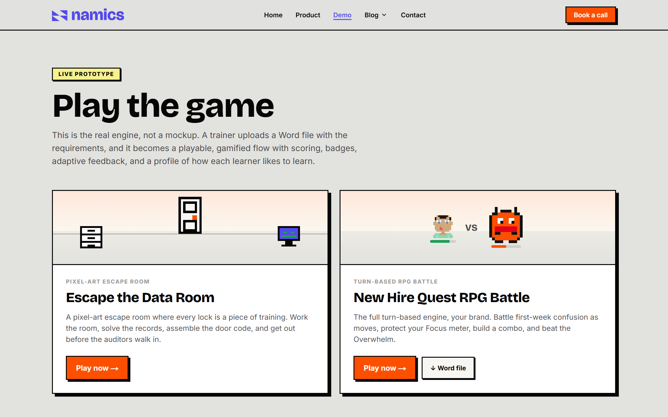
Escape the Data Room: point and click
A pixel-art escape room where every lock is a piece of training. Work the room, solve the records, assemble the door code, and get out before the auditors walk in. The same sprite engine that draws the battle draws the room.
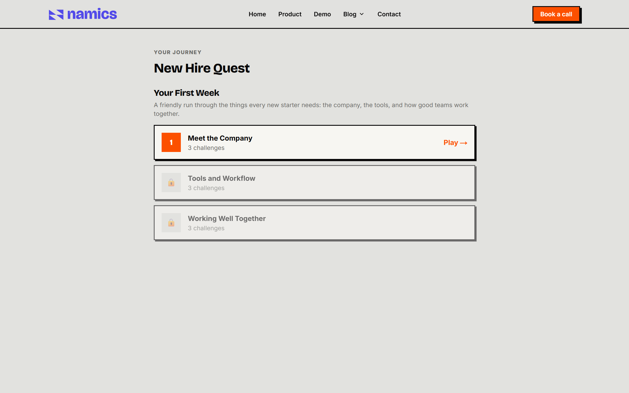
New Hire Quest: the simple player
The baseline mode, kept deliberately plain. It is what an uploaded Word file plays as, so it has to work with anything a trainer writes. Missions, stars, and a clear path through the first week.
The pipeline
Build the quiz, get a game
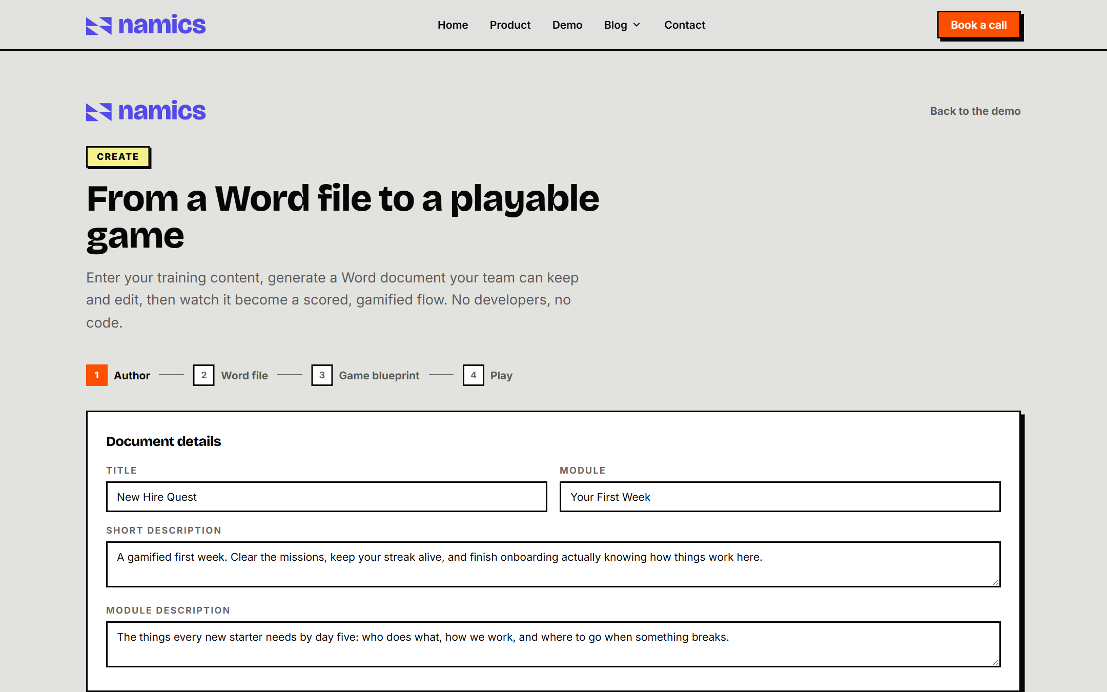
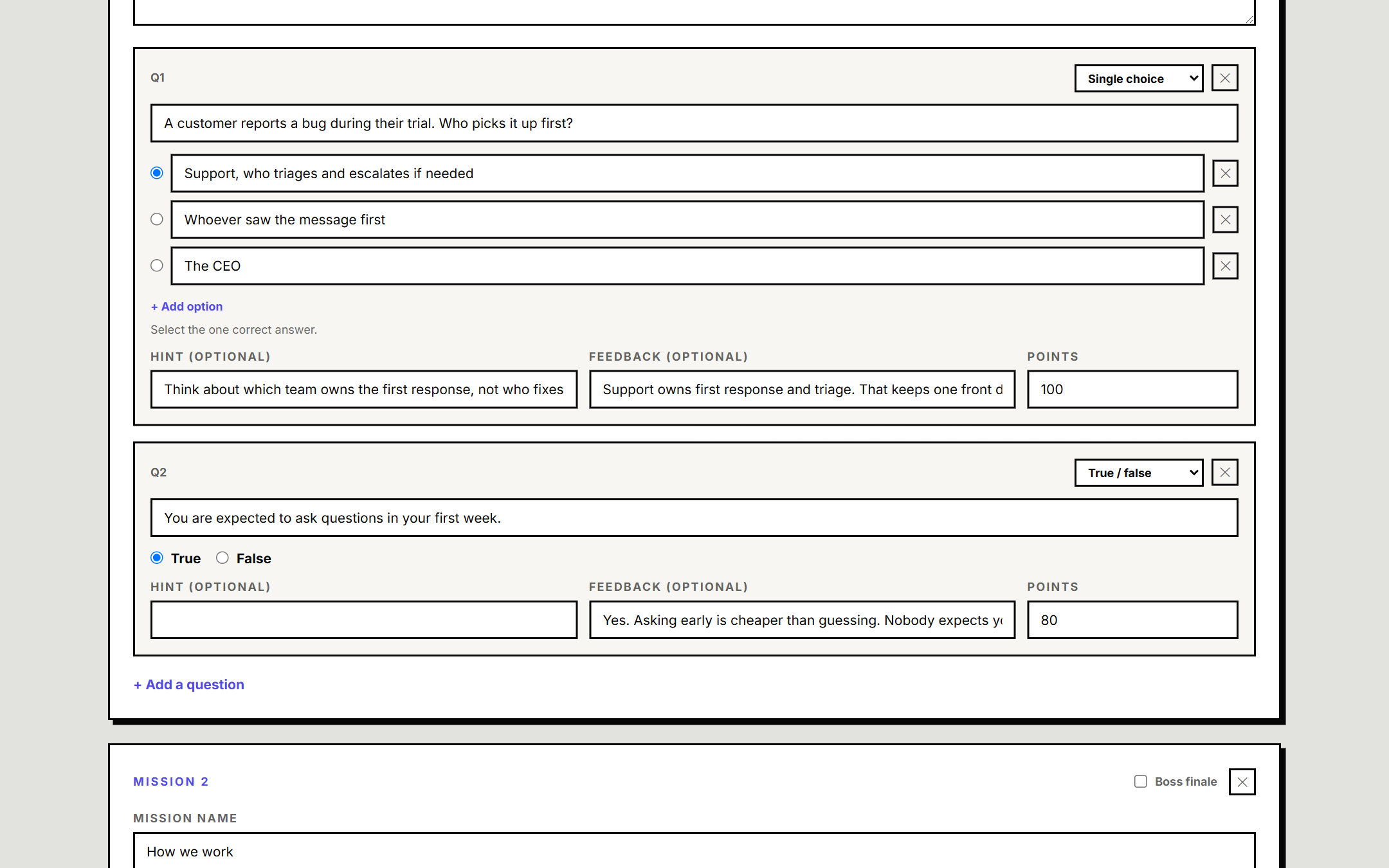
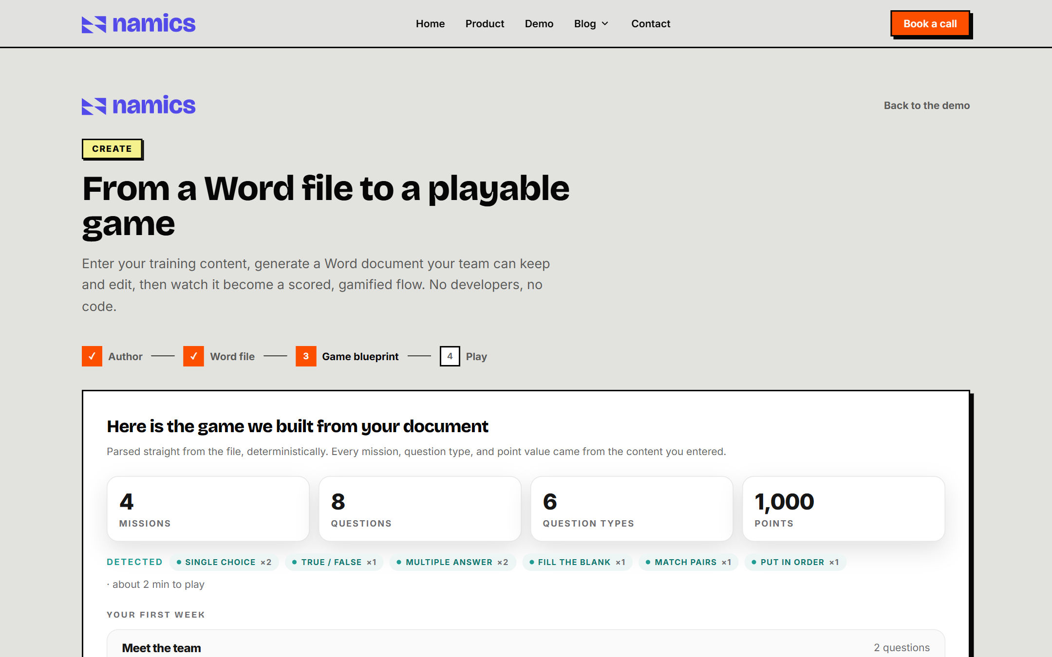
A trainer builds the training right in the browser. You author the missions and the questions, all six types, each with a hint, feedback, a point value, and a boss to close the week. The wizard then generates a real Word document the team can keep and edit, shows you the blueprint it parsed back out of that file, and drops you straight into playing it. Four steps, no code, no developers.
None of the parsing is guesswork. Every mission, question type, and point value comes from what you entered, so you get exactly the game you wrote. Already have a Word file? Upload that instead. The AI shows up later, on the learner side, reading how each person answers and shaping what comes next.
Design system
The system behind the site
One neo-brutalist kit runs the whole page: 4px corners, a hard black border, and a solid offset shadow on everything you can press. The color does the talking.
Primary button
Section tag
Step marker
Stat block
AI accent
Live in days
Bento card
Under the hood
One engine, any brand, built to stay up
The whole look is a set of CSS variables. Swap them and the same engine wears a different brand, from this hard-edged neo-brutalist kit to a soft corporate one, without touching a line of game code. Even the correct-answer green is kept out of the brand and used only inside the game, so a red-branded build never confuses the player with the enemy.
Under the playful surface the build is careful. Every marketing page is server-rendered and ships almost no JavaScript. Every integration fails gracefully, so the whole site runs with no keys configured. And the contact form clears validation, a honeypot, rate limiting, and a bot check before a single lead email goes out.
In the end
A brand with a charge.
A mark that hides a bolt, a voice with rules it actually keeps, and a site that does not describe the product so much as hand it to you. It looks and plays like the thing it sells, which is the whole point.