Case study
eleven
A design system and a three-language website for a barbershop in Burgas, built so the whole site ships as one 8.5kB script and a visitor can book a chair without picking up the phone.
- Client
- eleven barberstudio, Burgas
- Role
- Design system, website
- Scope
- Tokens, motion, booking, performance
- Year
- 2026
01The problem
Every booking arrived mid haircut
The shop had a logo and an Instagram account. It did not have a website. Every appointment was made by phone, and the phone rang while there were hands in somebody’s hair.
That costs twice. The barber stops cutting to answer, and the caller who does not get through goes to whoever picks up. Nothing on the internet could take a booking.
02Research
Where the customers actually come from
We looked at how people reach the shop today: a Google Maps listing, an Instagram profile, and word of mouth. Nearly all of it on a phone, most of it in the evening, a good part of it in summer when the town fills up.
Two facts came out of that and shaped everything after. The traffic is mobile on a seaside connection in August, so weight is a constraint rather than an audit at the end. And the customers here read Bulgarian, English and Russian, so the site has to as well.
03Empathize
Two people, and only one of them is browsing
The visitor is deciding, not researching. They want to know that the cuts are good and that they can get a slot on Thursday. They will give the page a few seconds on a bad connection, and they will not call to ask.
The barber is the second user, and he is holding clippers. Anything that needs his attention during the day is a failure. So the site had to take a booking without him, and stay correct without him editing it.
04Define
One job, stated plainly
Somebody in Burgas finds the shop on a phone and books a chair without calling. Everything else on the page is in service of that, and anything that was not got cut.
Three constraints came with it: it loads fast on a phone, it runs in three languages, and it looks like a shop worth sitting in. The last one is why there is a design system at all.
05Ideate
The brief came before the CSS
The design system was written as a document before it existed as a stylesheet. Colours, type scale, spacing, radii, worked up from a Cron Calendar style reference into a brief the build then followed literally. The first six lines of the stylesheet say so. Nothing in there is a value somebody eyeballed at two in the morning.
The wordmark was the only thing that already existed. The dark canvas, the ember accent and the whole token set are ours. Ember paints the booking button and the mark, and nothing else on the site is allowed to be orange, because one accent used once is what makes a single button read as the thing to press.
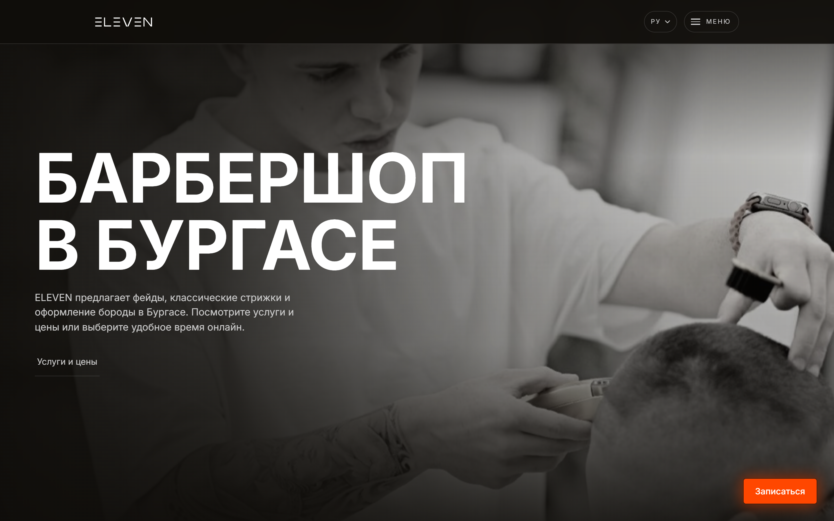
The other idea out of this stage is the opening. Instead of putting the wordmark on the page, put the page behind the wordmark, and let the mark fly up and become the navigation.
Color
Seven colors, one of them chromatic
Typography
Inter, and a display scale that fights back
Inter
Everything
400, 500, 700
Latin and Cyrillic out of one family, because the site runs in three languages and the headline has to set in all of them.
ТВОЯТ БРЪСНАР В БУРГАС
ABCDEFGHIJKLM NOPQRSTUVWXYZ abcdefghijklm nopqrstuvwxyz 0123456789
Design system
The parts, live
Rendered here in the client’s own colours, in the browser, not photographed. Cards at 0px, buttons at 4px, pills at 9999px, everything on a 4px unit, page capped at 1200px.
The booking dock
Ghost link, section nav
Price row
4+ години опит
The one eyebrow on the site, and it counts itself.
Caption, 13px, tracked
1px dots, 22px apart, at hairline alpha. It reads as grain on the surface rather than as pattern, which is the only reason it earns a place in the system.
Dot field, the one texture
Graphite on obsidian
Cards keep square corners. Only buttons round.
Surface and hairline
The opening reveal
Looking through the wordmark
The site scrolled top to bottom on a phone.
The mark is the aperture
The letterforms are an SVG mask over a photograph of the shop. Nothing is layered on top of anything. You are looking through the wordmark.
Zoom alone goes black
The centre of the wordmark is the gap between two letters, so past a certain scale the frame is looking through empty space. A rect fades up under the mask while the last letterform is still sweeping across, and hands the frame over.
It resolves, it does not just end
The scale curve is pow(q, 2.2) rather than linear. That holds the wordmark legible through the first third of the track, then accelerates hard, so the trip reads as a reveal instead of a zoom.
It lands as the nav
The flight to the header is measured, not guessed, and re-measured on resize, on orientation change, and on fonts.ready. The header mark is held at zero opacity and crossfades in over the last 6% of the flight, so there is never a second wordmark on screen.
Motion
The animation chases the scroll, it is not bound to it
Three tall tracks with sticky stages: the opening, the barber slice, the closing film. Scroll progress inside a track maps onto the animation, and everything runs from one damped requestAnimationFrame loop.
The loop moves the animation toward the scroll position instead of onto it, cur += (target - cur) * 0.16. Bound one to one, a flick on a phone snaps the reveal to its end frame and reads like dragging a slider. Chased, the same flick carries weight and settles. That is the entire feel of the page and it is one line.
Motion also finishes before the track does. The progress curve compresses the animation into the first 82% of the track, so the last stretch of scroll is a beat on a finished frame instead of dead travel. It is what stops a long reveal feeling long. The easing is in and out rather than ease out, which front loads the trip: two thirds of the distance goes in the first quarter and the wordmark is off the top of the frame before you have read it.
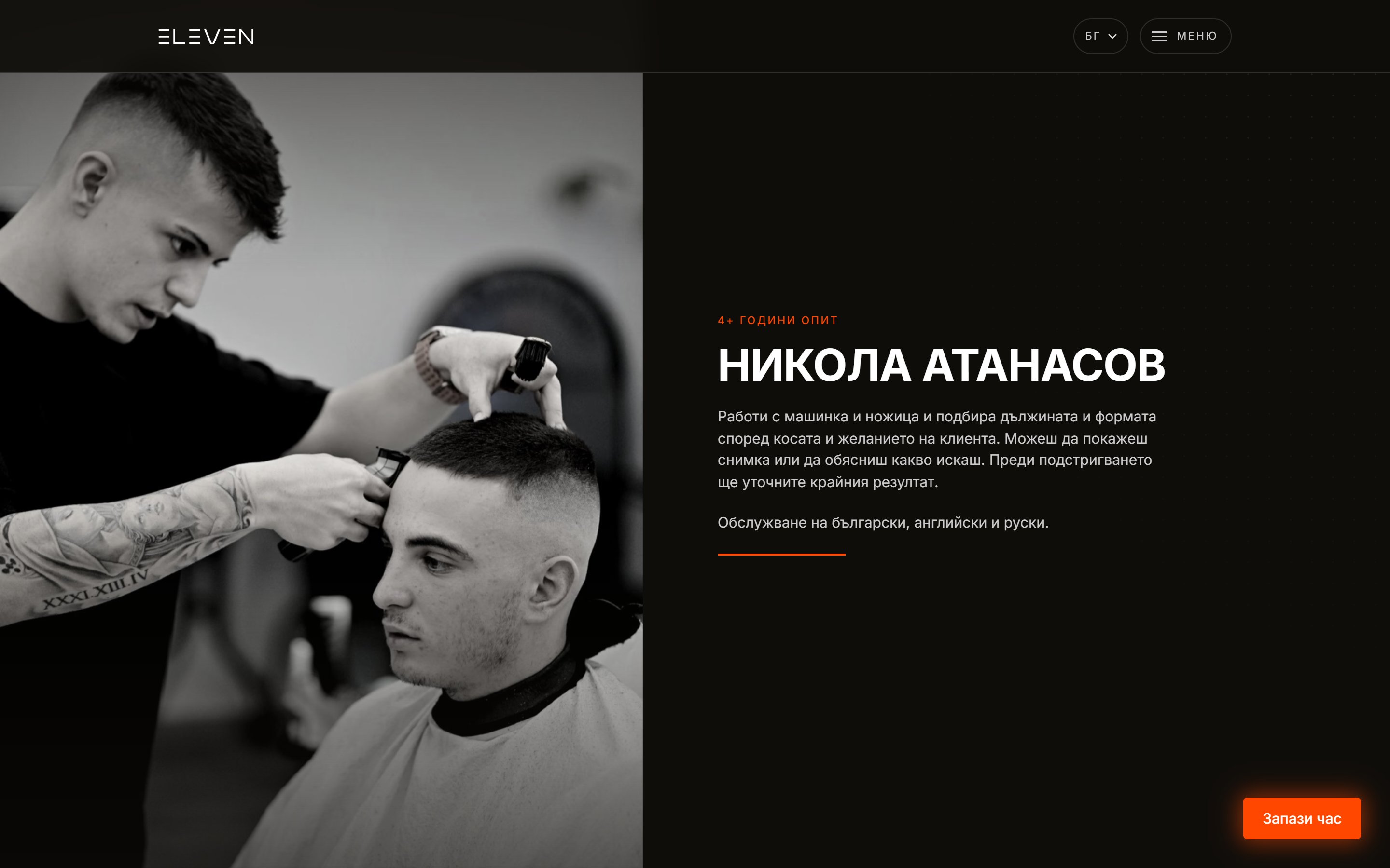
The barber slice is one photograph, clipped open from the top while it settles out of a slow push in. The version before it shredded the picture into fourteen sliding bands, and because each band carried its own residual offset the seams never landed flush. The photograph read as torn. A single element cannot tear.
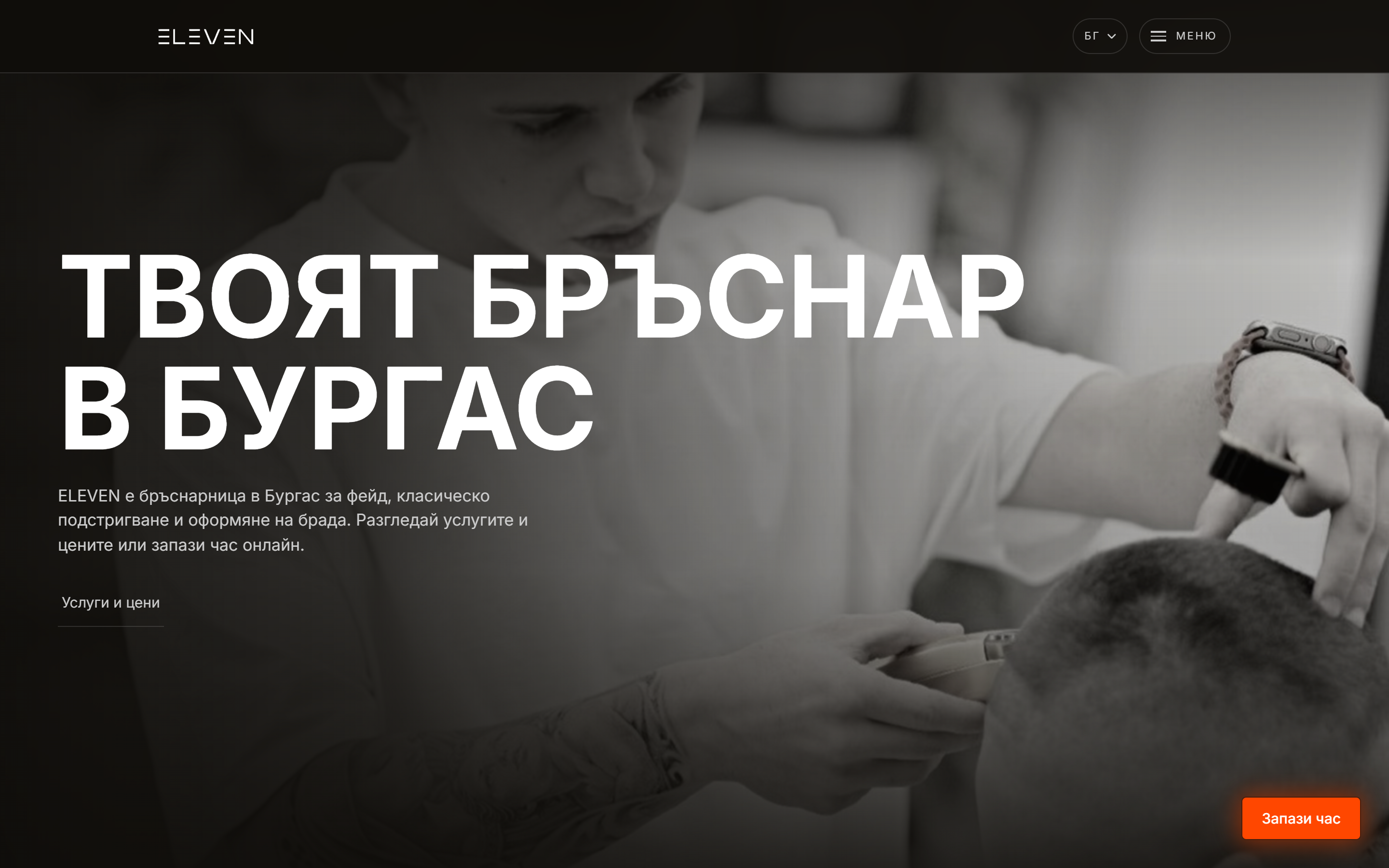
The site
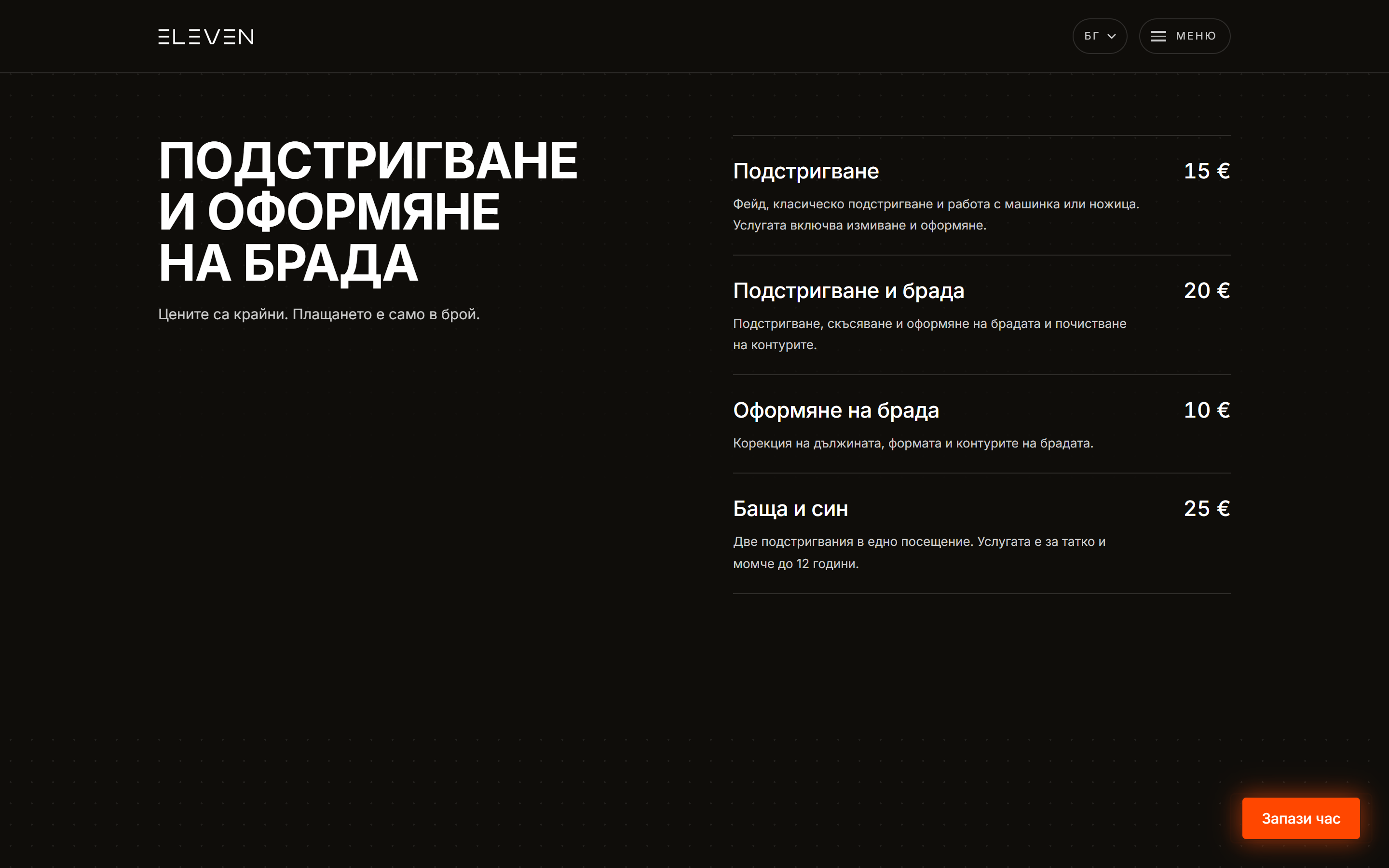
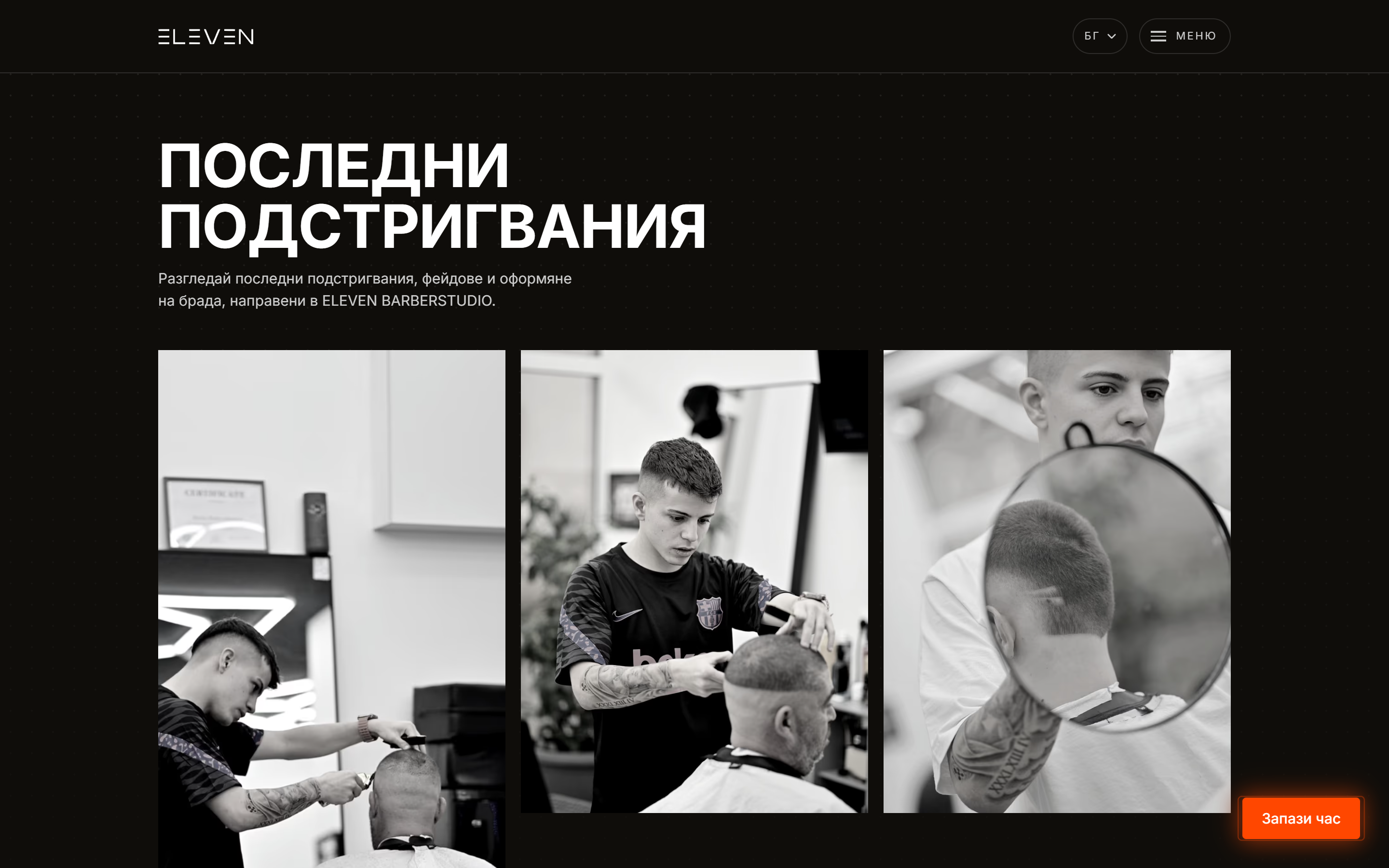
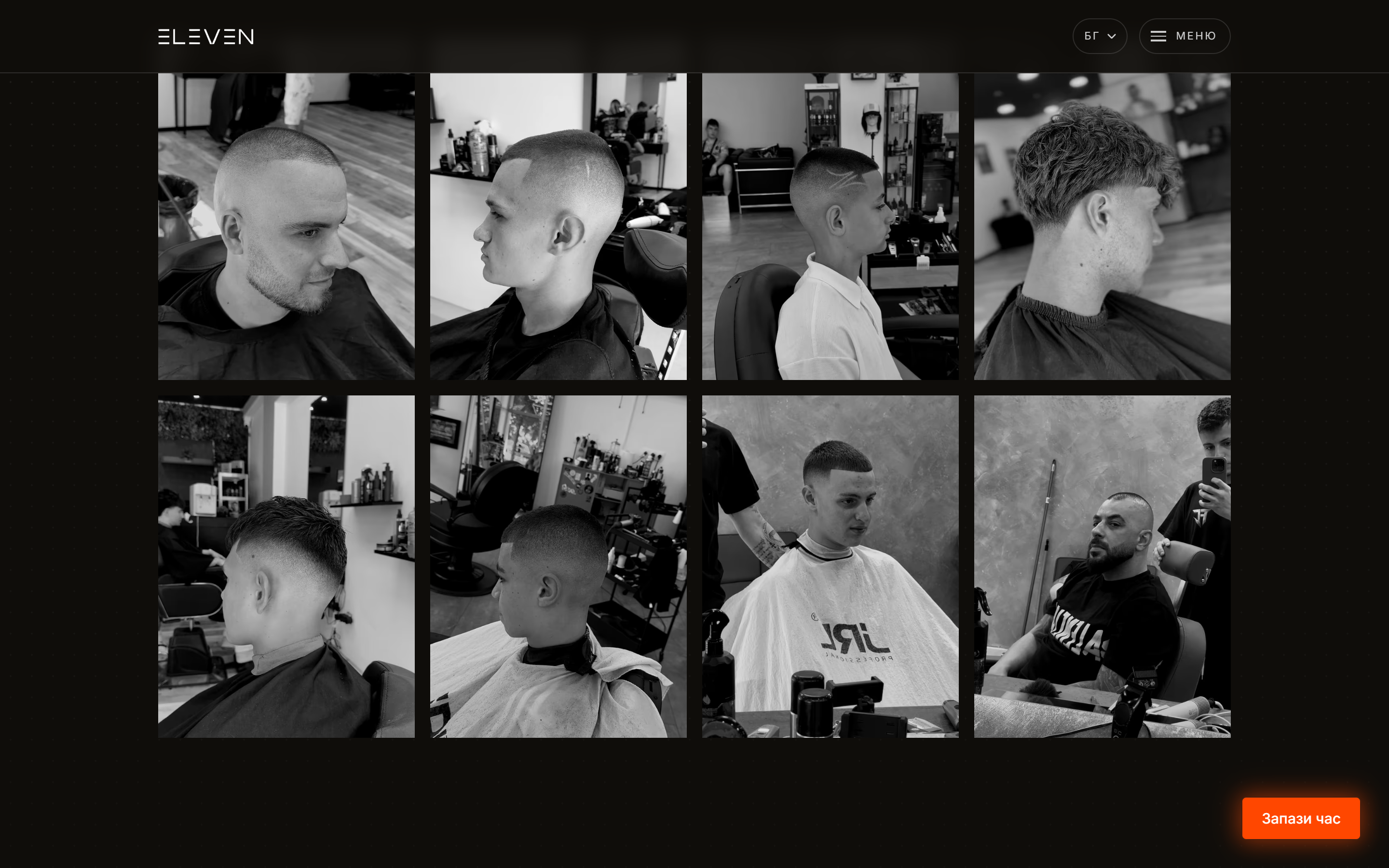
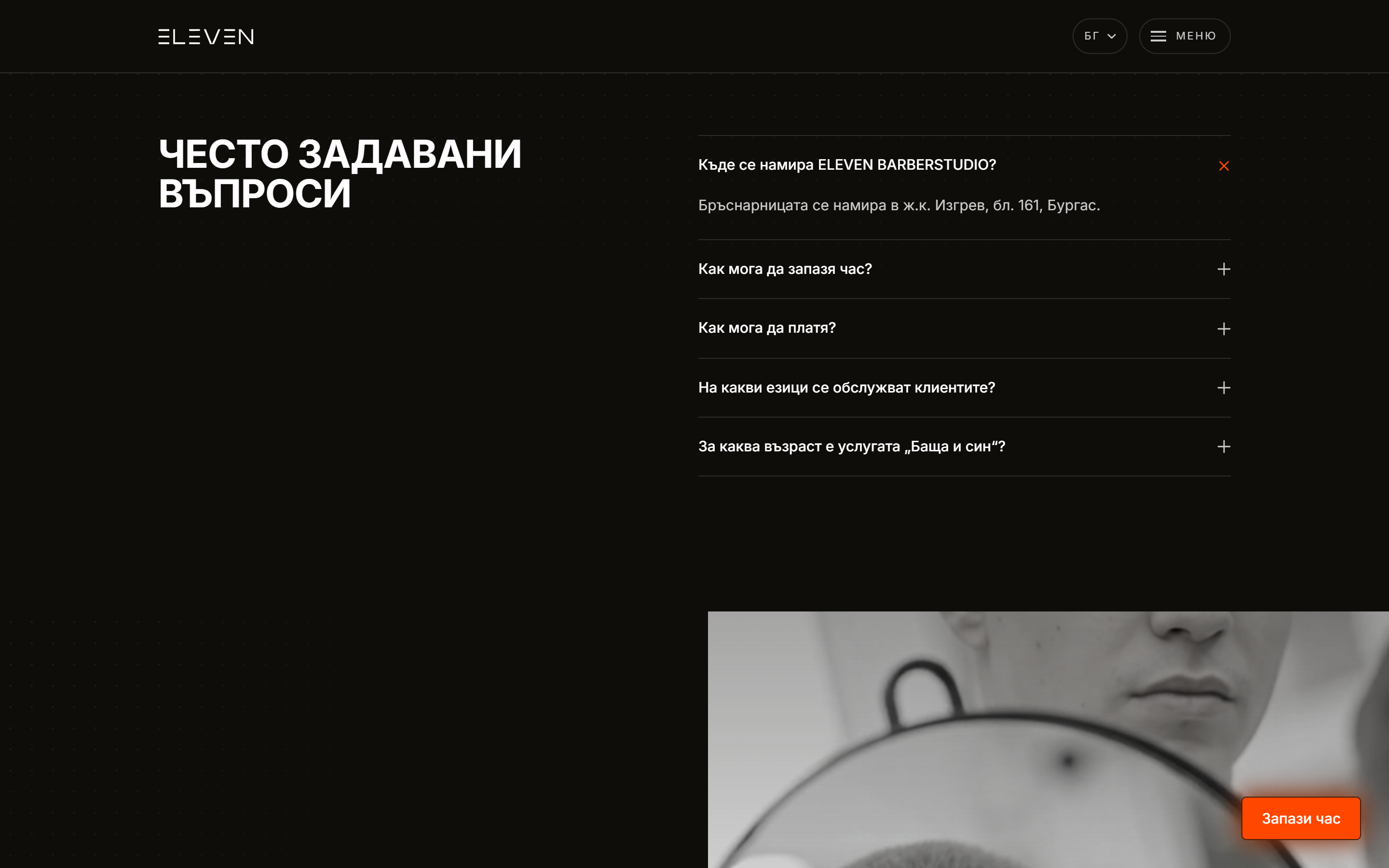
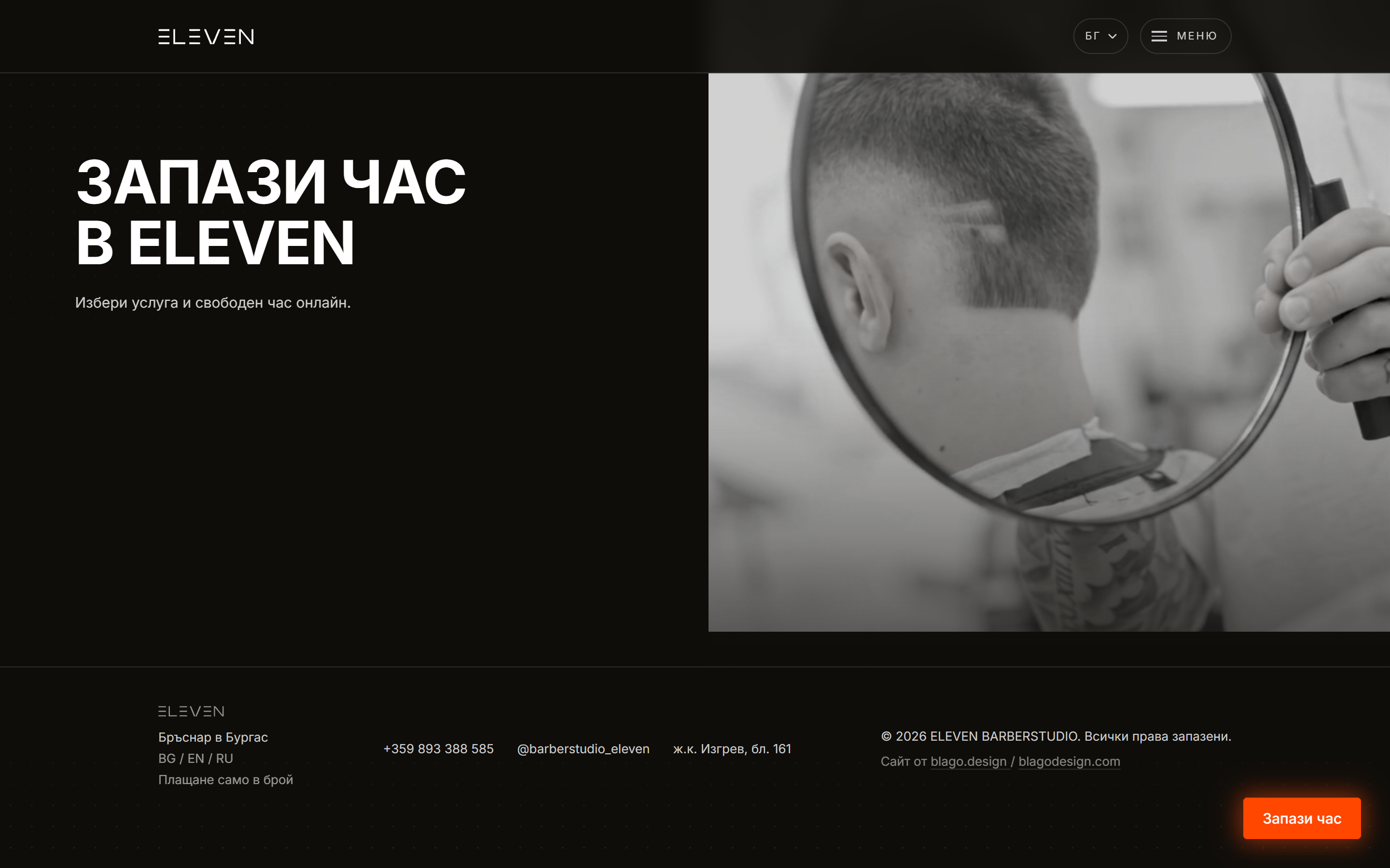
Section by section, in three languages

Booking
Ten seconds down to 335 milliseconds
Booking is a Cal.com panel that opens over the page, not a new tab. Losing the visitor mid decision is the expensive part of a booking flow, and people mostly do not come back from a stray tab.
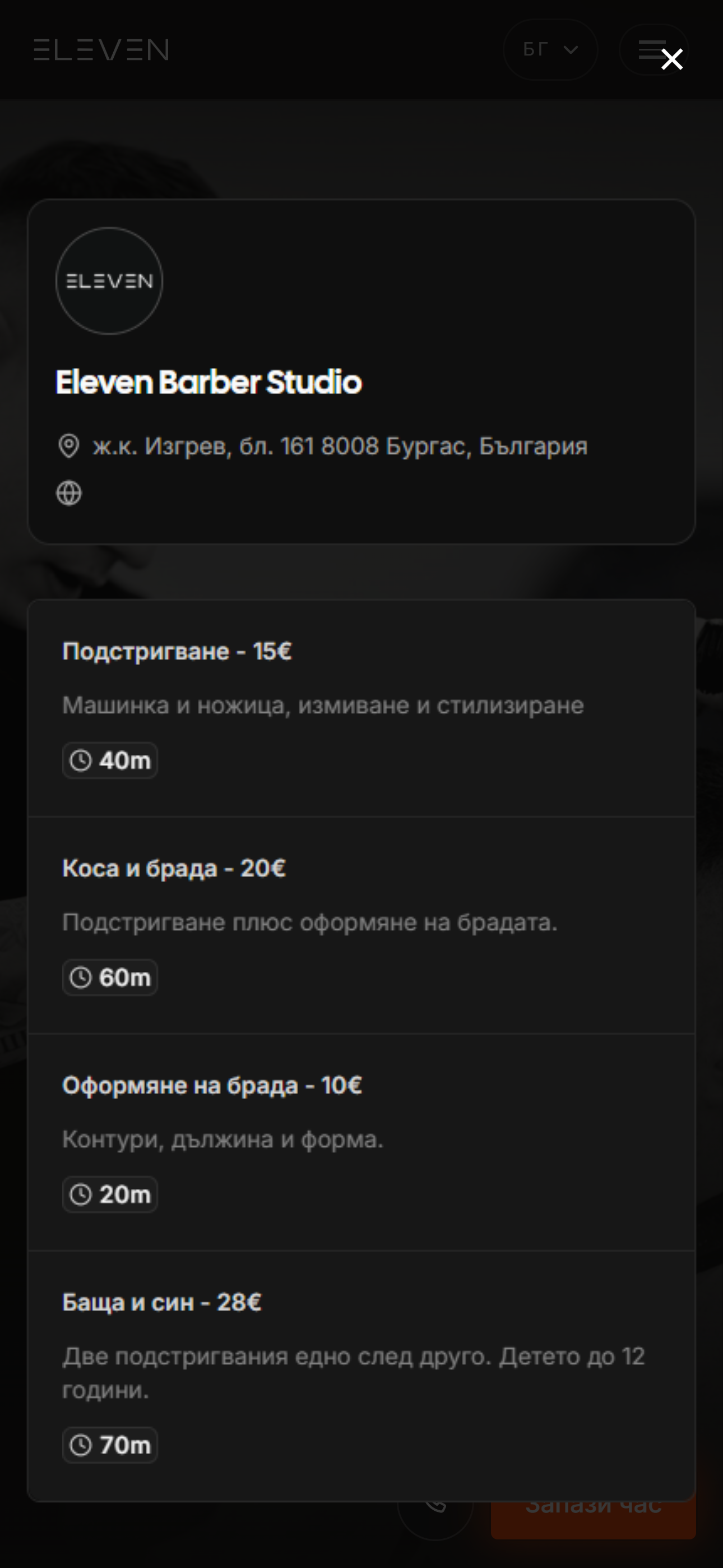
The panel opens over the page in the site’s own colours, already warm.
The problem
The panel took about ten seconds to open on a phone. The embed is 22kB and the thing behind it is a whole calendar application.
The fix that did nothing
We warmed the embed on pointerenter and touchstart, which is fine on a desktop and worth nothing on a phone, because touchstart lands a few milliseconds ahead of the click. The visitor pressed the button and then watched an empty panel while the embed, the calendar and a month of availability downloaded from scratch.
What worked
A timing change, not a size one. The embed warms on a MutationObserver watching the booking dock appear. The dock arrives when the opening reveal resolves, which is a scroll and a read away from anyone reaching for it, and that gap is the head start. Anyone who leaves during the opening never pays for any of it. A preconnect to app.cal.com takes DNS, TCP and TLS off the critical path.
Measured
On Fast 3G with 4x CPU throttling, the panel is on screen at 335ms and the calendar is usable at 1.6s, with the embed’s requests already finished before the tap.
Three smaller calls
Cal is handed the site’s own accent, so the panel does not arrive as a white sheet with somebody else’s blue in it. The button stays a real link to the booking page throughout, so if the script never runs, or Cal is blocked, or anything throws, the click is an ordinary navigation and the booking still happens. And there is one booking button on the page, the floating dock, and one only. A second one went into the closing section once and came straight back out.
06Test
Three things that shipped wrong first
The headline walked into the header. Sized off viewport width alone, the display clamp grew to the full height of a 16:9 laptop and collided with the nav, which is how it shipped once. The fix is a vh term inside the clamp, and a habit of testing at 1920x841 rather than 1440x900.
The photograph read as torn. An earlier version of the barber slice shredded the picture into fourteen sliding bands, and because each band carried its own residual offset the seams never landed flush. It is now one element clipped open from the top. A single element cannot tear.
The booking panel took ten seconds, which is its own section above, because the fix was a timing change rather than a size one.
With motion turned off, prefers-reduced-motion skips the loop and paints the same end state. Copy outside a track is revealed by CSS scoped to a js class, so nothing is trapped invisible when JavaScript does not run, and the language list only collapses once the script runs, so a visit without JavaScript keeps all three languages reachable.
Checked on every pass, in all three languages: exactly one h1, the heading line counts, the booking button count, no horizontal overflow from 360px to 1920px, console errors, and both JSON-LD blocks.
Performance
Small on purpose, from the first commit
8.5kB
JavaScript, whole site
335ms
to the booking panel on Fast 3G
1.6s
to a usable calendar
3
languages, one content file
0
framework runtime
20kB
gallery tiles, down from 190kB
3 days
brief to live, eleven commits
0
layout shift, mobile and desktop
Four hundreds, twice
| Lighthouse 12, live site | Mobile | Desktop |
|---|---|---|
| Performance | 100 | 100 |
| Accessibility | 100 | 100 |
| Best practices | 100 | 100 |
| SEO | 100 | 100 |
| Largest contentful paint | 3.0s | 0.9s |
| Total blocking time | 0ms | 0ms |
| Cumulative layout shift | 0 | 0 |
One JavaScript file, 8,511 bytes, for the entire site. No framework runtime, no hydration, no client side router. One stylesheet at 22kB. The built Bulgarian home page is 50kB of HTML.
Every image is AVIF, quality 62 on the grids and 82 on the two full bleed photographs, generated at build into 75 variants. The JPG masters stay in the repo. That took the gallery tiles from around 190kB to under 20kB each.
Blocking time is zero and layout shift is zero on both form factors, which is what 8.5kB and fixed aspect ratios buy you. Nothing on the page moves after it paints, and there is no framework waiting to hydrate before it responds.
Performance, accessibility, best practices and SEO all come back at 100, on mobile and on desktop. That is not a tuning pass at the end. It is what is left when the site ships one script, sets an aspect ratio on every image, and renders its text as text.
The other honest number: the closing video is 2.8MB, the single largest thing in a 6.1MB build. It sits below the fold behind an IntersectionObserver, so it costs nothing on first paint. It is still 2.8MB.
07Implement
Astro 5, static, three days
Astro 5, static output, deployed on Vercel from main. The dependency list is astro, the sitemap integration and sharp. There is no framework runtime on the page because there is no framework on the page. Bulgarian sits at the root, English and Russian under /en/ and /ru/, on Astro’s own routing.
One content module is the only place anything factual is written down: all three languages, the address, the phone, the hours, the prices, the links. The pages, the structured data and the footer all read from it, so a fact changes once and changes in six places. Six indexable URLs, with canonical and hreflang built off one path value, so the gallery pages point at each other rather than at the home page.
Every photograph is graded to black and white in the file rather than with a CSS filter, by a small sharp script, so it is the same picture everywhere it is used. Images ship as AVIF. Caching is a year and immutable on the hashed assets, with the same headers written a second time in the format other hosts read, so the site can change hosts without quietly losing them.
Eleven commits, three days, 28 to 30 August 2026.
In the end
A barbershop that books itself.
One accent on near black, a wordmark that opens the page and then becomes the navigation, and a booking panel that is already warm by the time anyone reaches for it. The shop stopped taking bookings mid haircut, which was the whole reason to build it.