Case study
blago.design
Our own studio, from name to launch. A monochrome, full-screen deck that tells the promise in first person, one panel per scroll.
- Role
- Brand, voice, product, web
- Year
- 2026
- Scope
- Identity, voice, system, site
- Industry
- Design studio
01The studio
A boutique brand and product studio
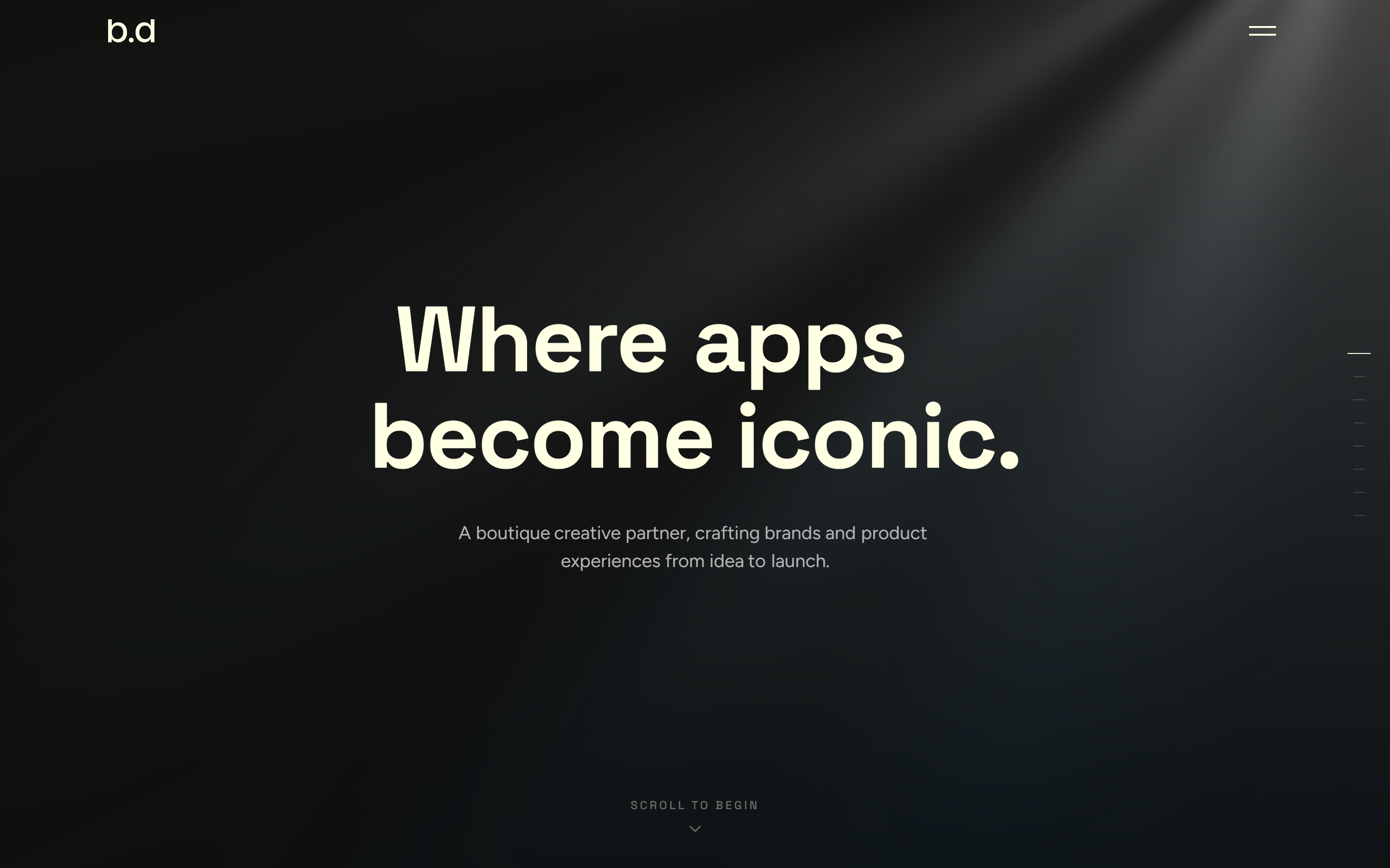
blago is a boutique creative partner. We craft brands and product experiences from the first idea to the day they launch.
For our own site we set the same bar we set for clients. It had to state what we do, show how we work, and feel like the work itself.
02Research
Why we went fully monochrome
We looked at the studios we admire and noticed the loud ones blur together. So we took color out of the picture and let type and motion carry the whole design.
Cream on near-black, zero chroma, sharp corners. The restraint is the point. When every studio reaches for gradients, quiet reads as confidence.
03The brief
What the site had to do
We wanted a site that moves like a deck. One gesture, one panel, concept to launch, with nothing to scroll past and nowhere to get lost.
It had to hold up on a phone, respect reduced motion, and never flash a half-built screen. Fast, legible, and quietly sure of itself.
Logo
The wordmark
A compact monogram set in the display face and drawn on a baseline grid. No icon, no lockup. The letters carry it. b.d reads two ways at once, the blago.design domain and Blago Dimitrov, the name behind the studio.
Color
Five tones, no color
Typography
Two families, three roles
Space Grotesk
Display + labels
Bold 700 · Medium 500
Headlines and tracked-caps labels.
Aa Bb Cc
ABCDEFGHIJKLM NOPQRSTUVWXYZ abcdefghijklm nopqrstuvwxyz 0123456789
Figtree
Body
Regular 400 · Medium 500
Ledes and long-form copy.
Aa Bb Cc
ABCDEFGHIJKLM NOPQRSTUVWXYZ abcdefghijklm nopqrstuvwxyz 0123456789
The voice
How the studio sounds
A small studio gets judged on how it talks almost as much as what it makes. Ours is the voice of the senior person in the room: calm, specific, and quick to tell you what they actually think. Type and motion carry the design, so the words can afford to be few.
Assured, not loud.
We say a thing once and let it stand. If it is true it does not need an exclamation mark behind it.
Precise, not clinical.
Specifics carry the craft. What you get, when it lands, and why it was made that way.
Warm, not familiar.
We write like a partner already in the room. Close enough to be direct, never chummy.
Curious, not uncertain.
We ask real questions, then commit to an answer. Staying open is not the same as hedging.
The voice in three moments
Introducing the work
A boutique creative partner, crafting brands and product experiences from idea to launch.
Giving a hard opinion
We would not lead with the mascot here. It softens a product that needs to look reliable. Keep it for social.
On money and time
Six weeks, fixed. If the scope moves, you hear it from us before you see it on an invoice.
Anyone can sound good in a headline. The voice is worth having because it holds up in the other two, where a client is deciding whether to trust us.
The website
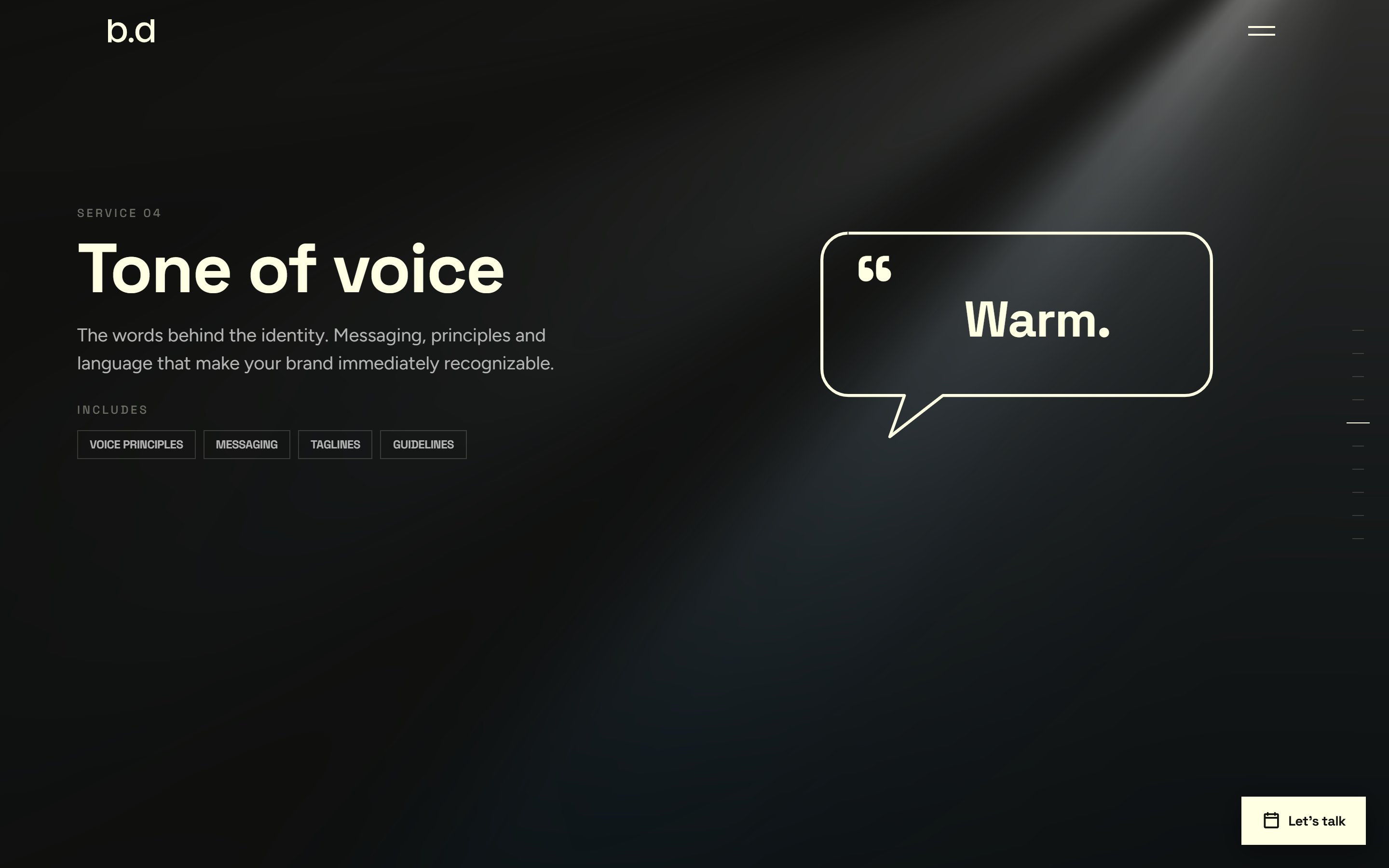
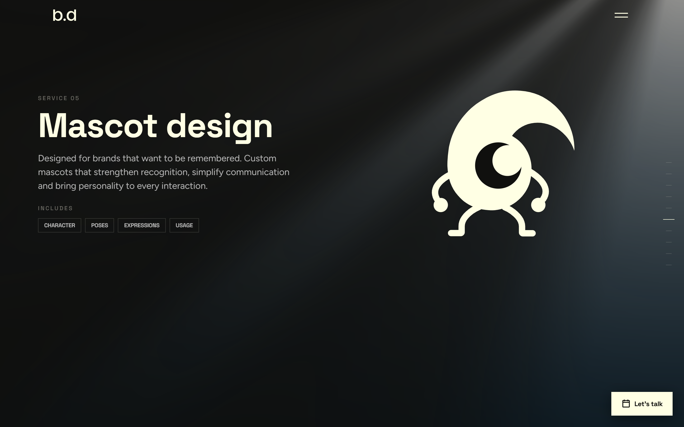
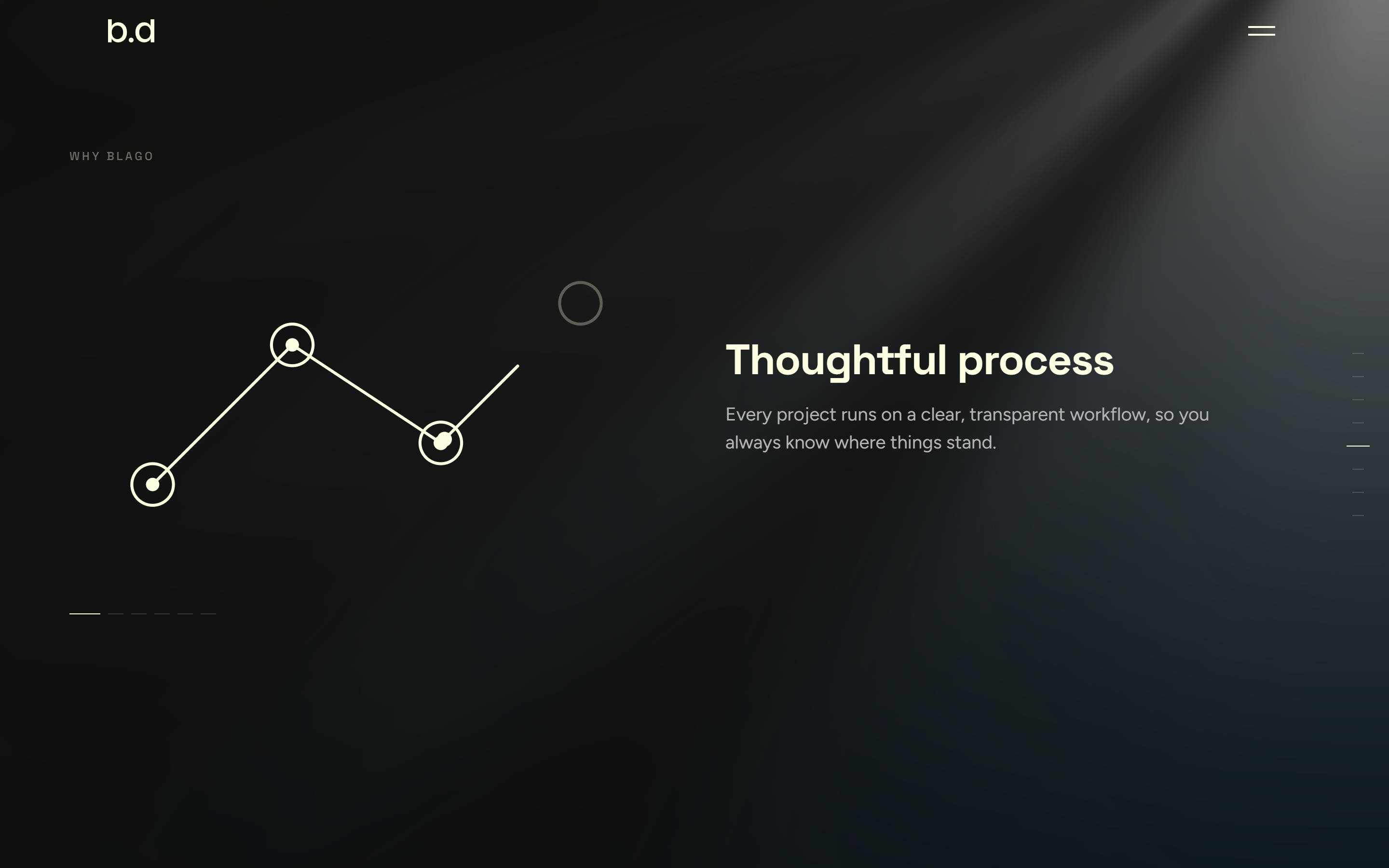
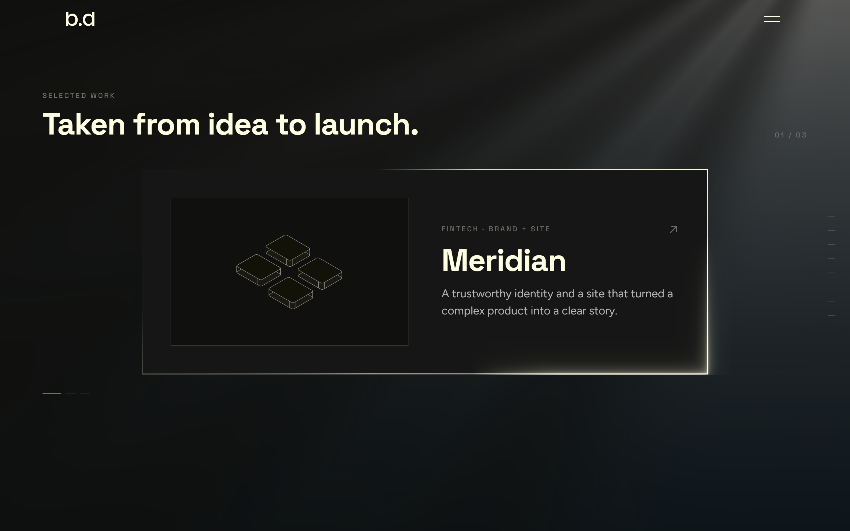
The whole site is a deck
The site is not a page you scroll. It is a full-screen deck. One gesture moves you one panel, hero to closing, and there is no scrollbar to get lost in.
Some panels hold more than one idea. On those, the same gesture steps sideways through each element before the next one moves you down. Turn on reduced motion and the whole thing falls back to a plain stacked page, with nothing hidden.
Mockups
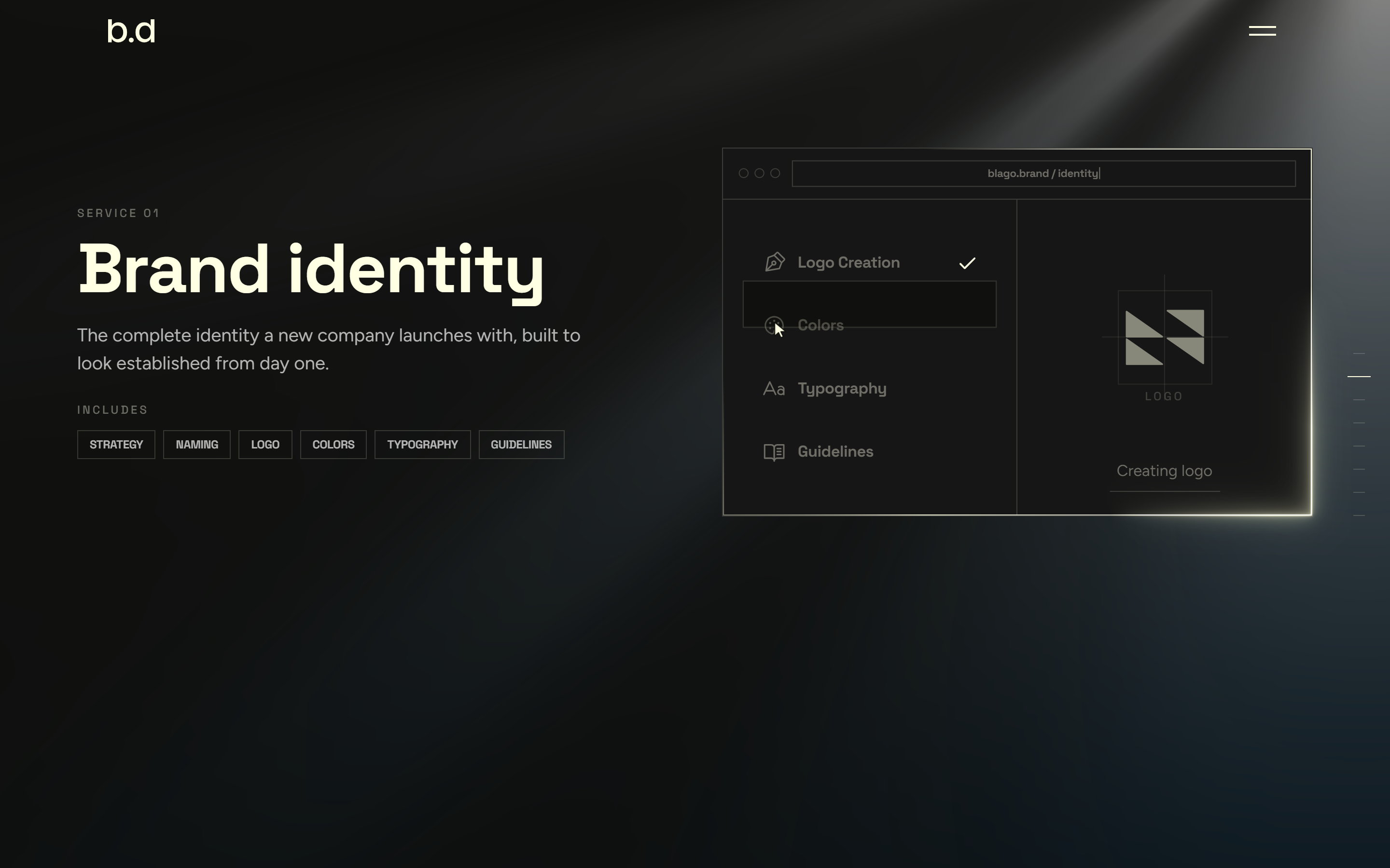
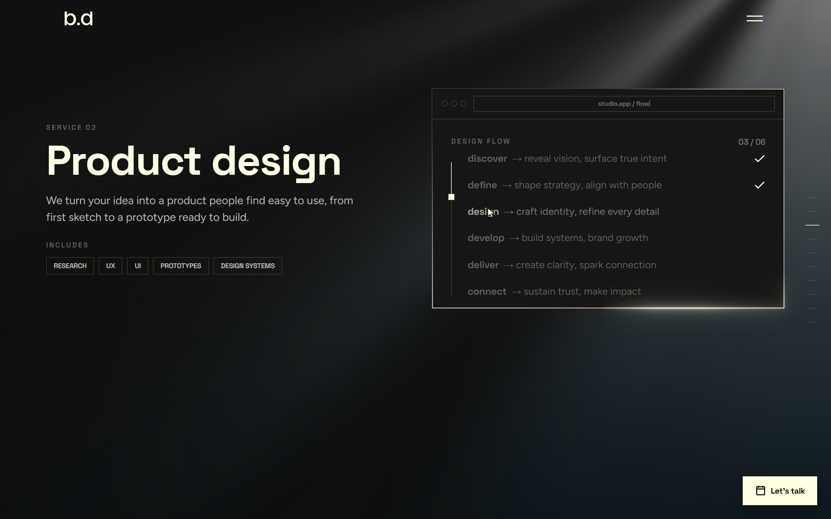
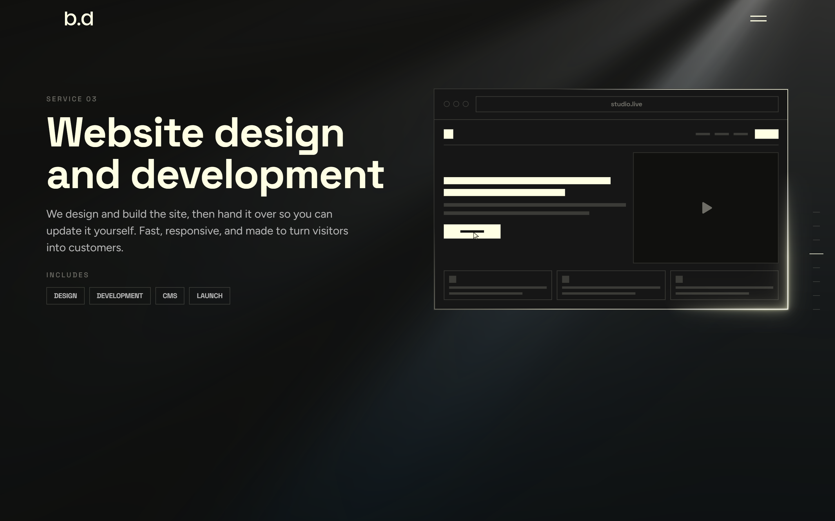
The deck, panel by panel
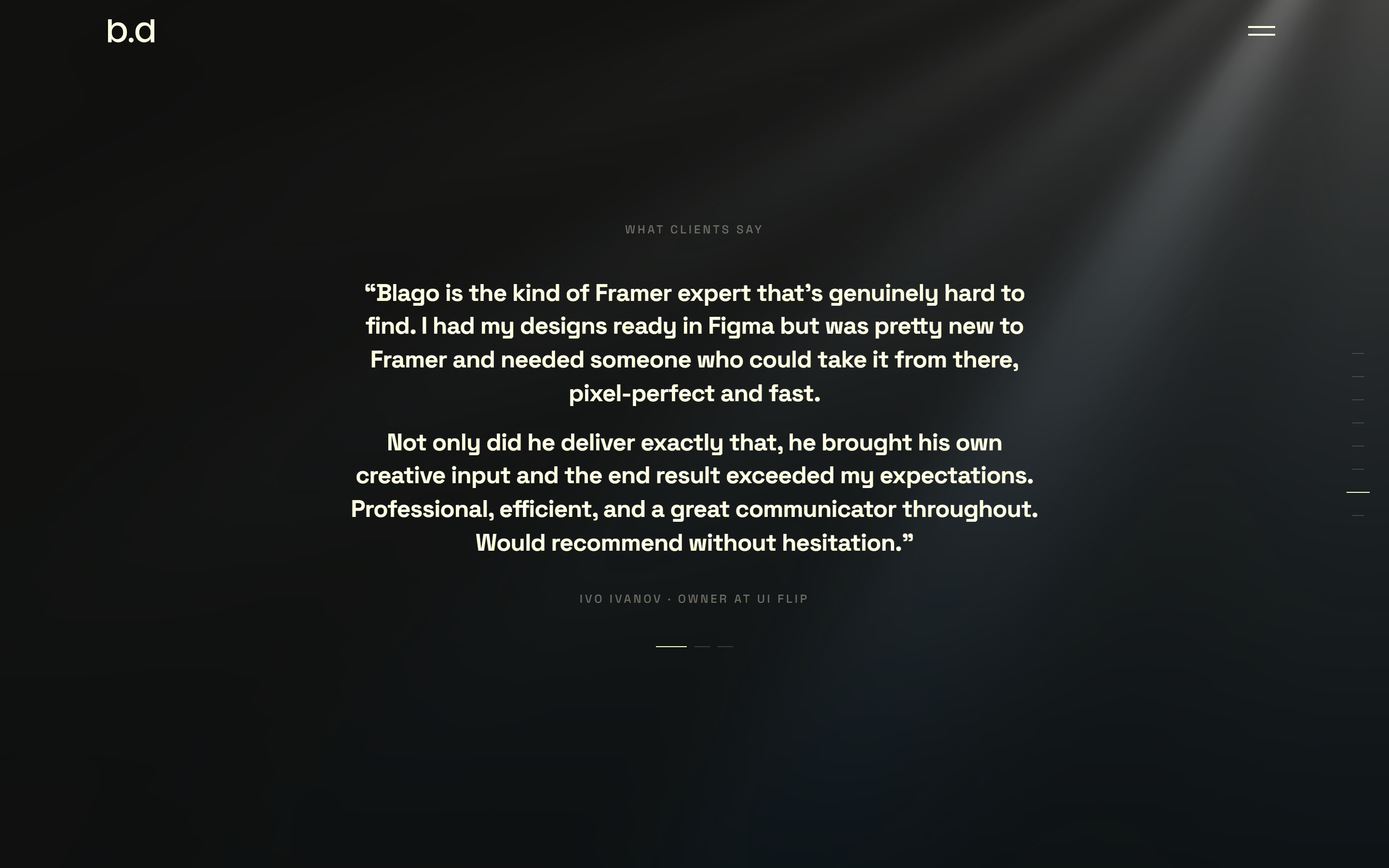
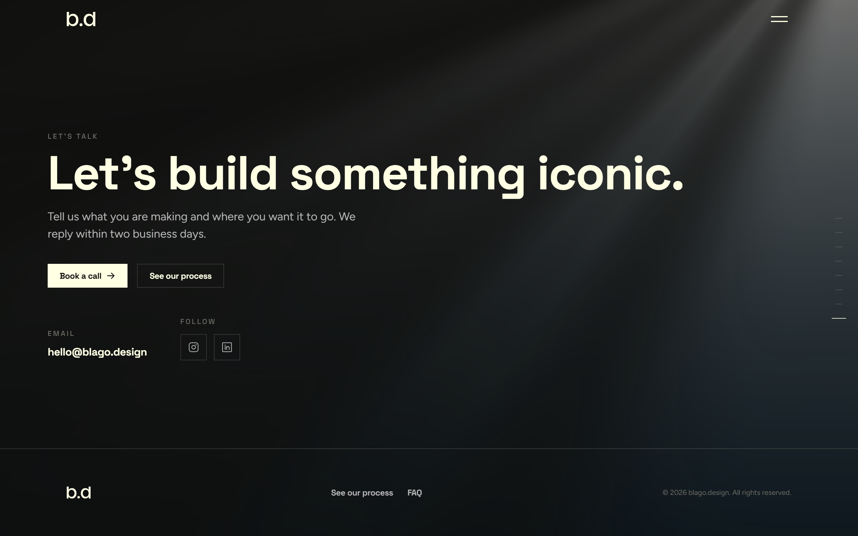
The motion
Everything moves, nothing shouts
Light that never leaves
One layer of cream light rays sits behind the whole deck, rendered in WebGL. It does not scroll away between panels, so the room stays lit as the content changes.
One browser, reframing
Across brand, product, and web, a single browser window navigates itself. The URL retypes, a cursor performs the action, and the same frame reshapes from an identity build to a live site. The promise, shown not told.
Diagrams that draw themselves
Every reason to work with us is a small line drawing that strokes itself on and loops. No stock icons, no photos. Type and motion do the talking.
A voice and a mascot, alive
The tone-of-voice panel speaks, one word revoicing through warm, bold, and clear. The mascot assembles limb by limb, then settles into a gentle idle. Both draw themselves, frameless, in the same mono line.
Beyond the deck
The pages around it
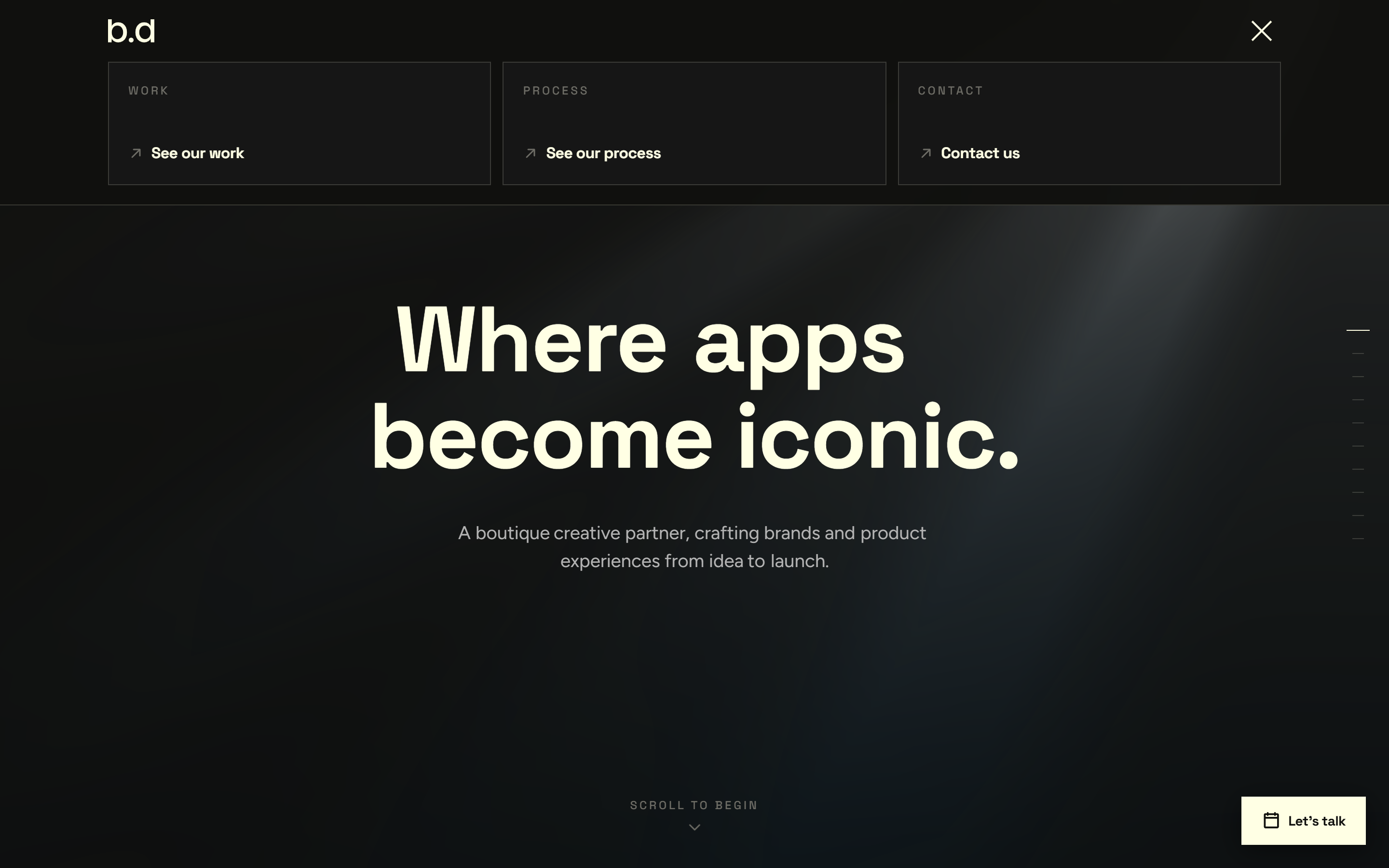
A menu that unfolds
The nav is one button. It opens into a set of cards that stagger in, Work, Process, Contact, then folds away. The same minimal bar sits on every page.
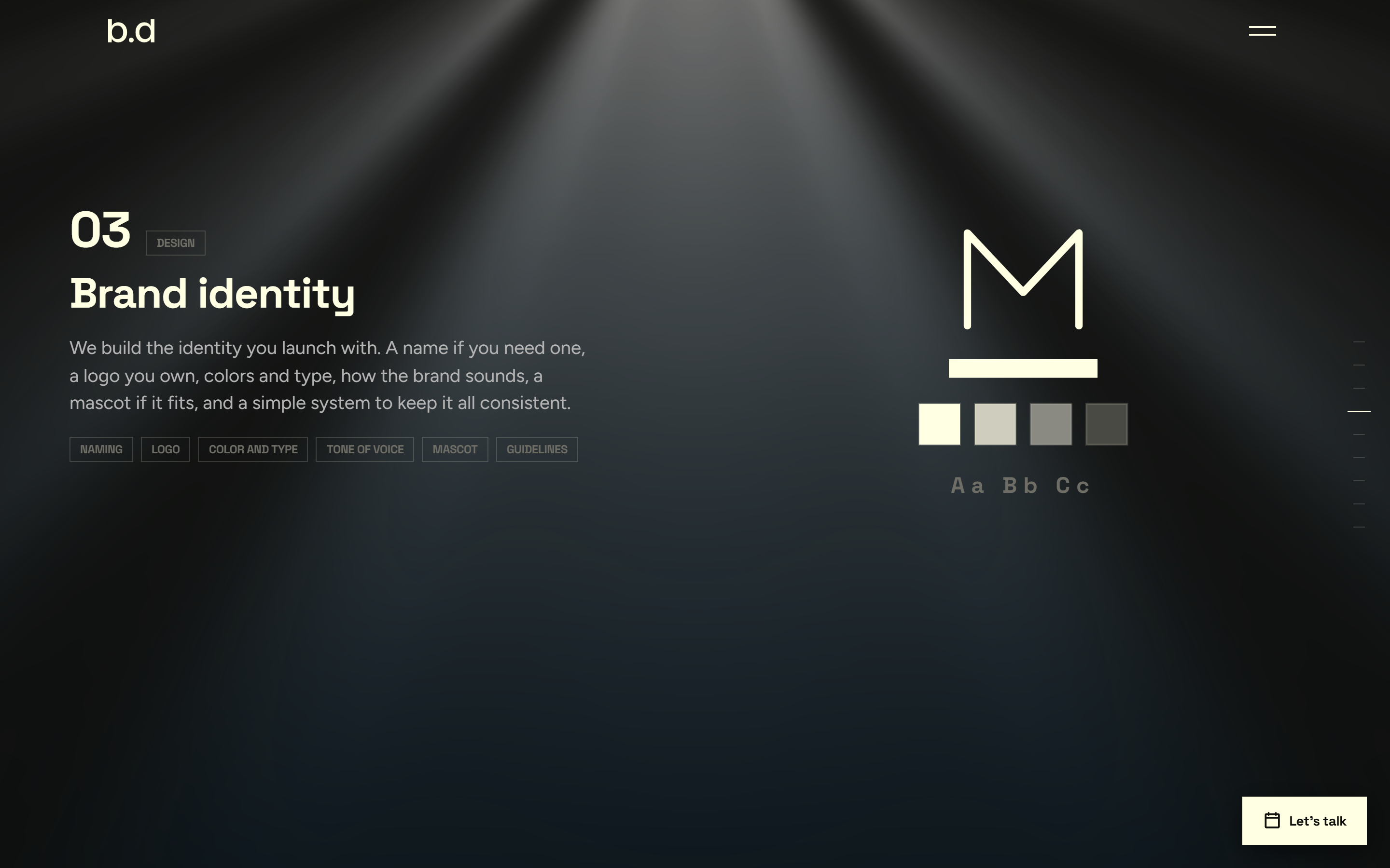
The process, step by step
A second deck walks a client through how we work, one animated step per screen, from kickoff to launch and handoff. Each step draws its own diagram.
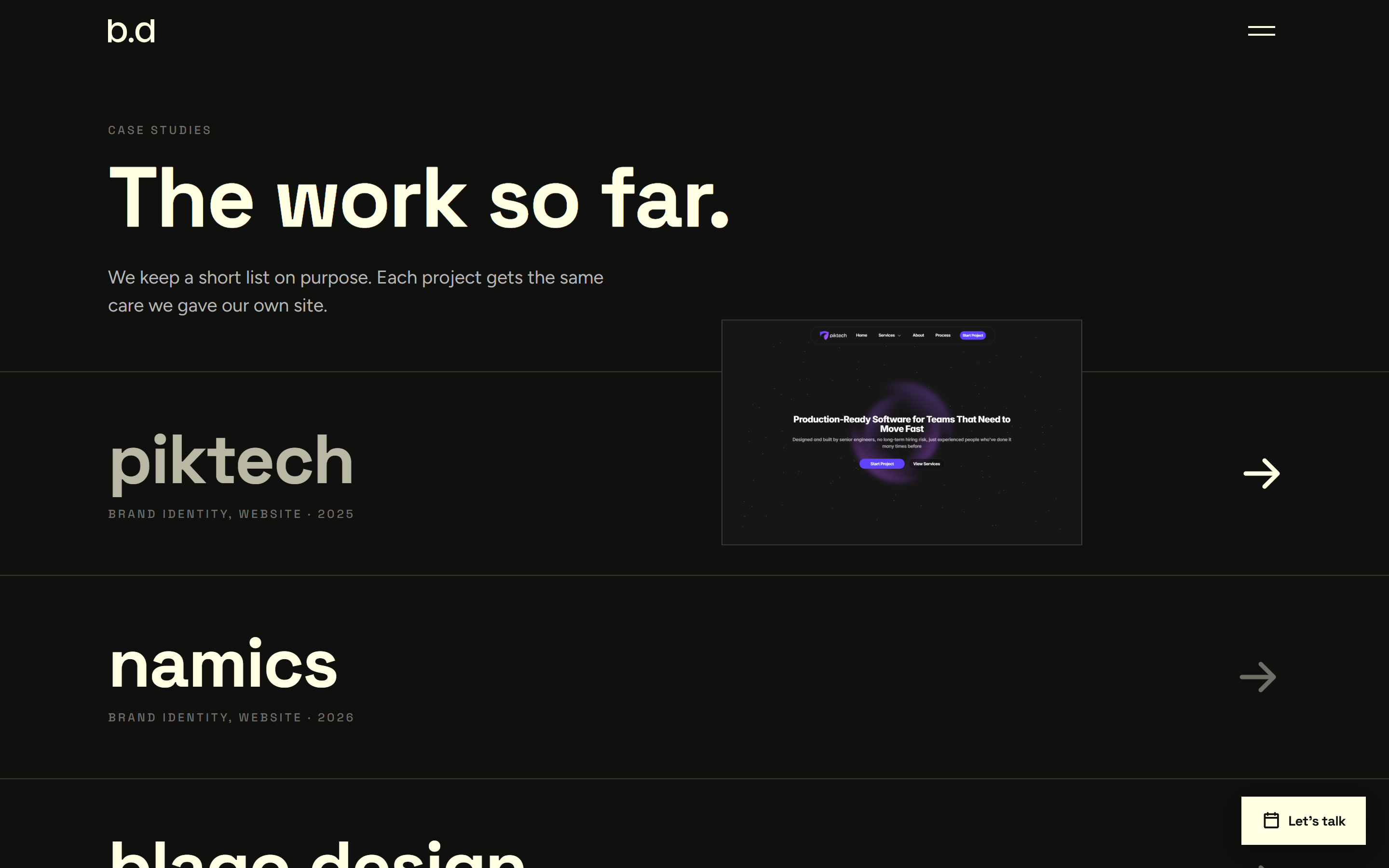
Work that previews itself
The work index is a list of oversized names. Hover one and a screenshot floats in and trails the cursor. On touch it falls back to plain cards.
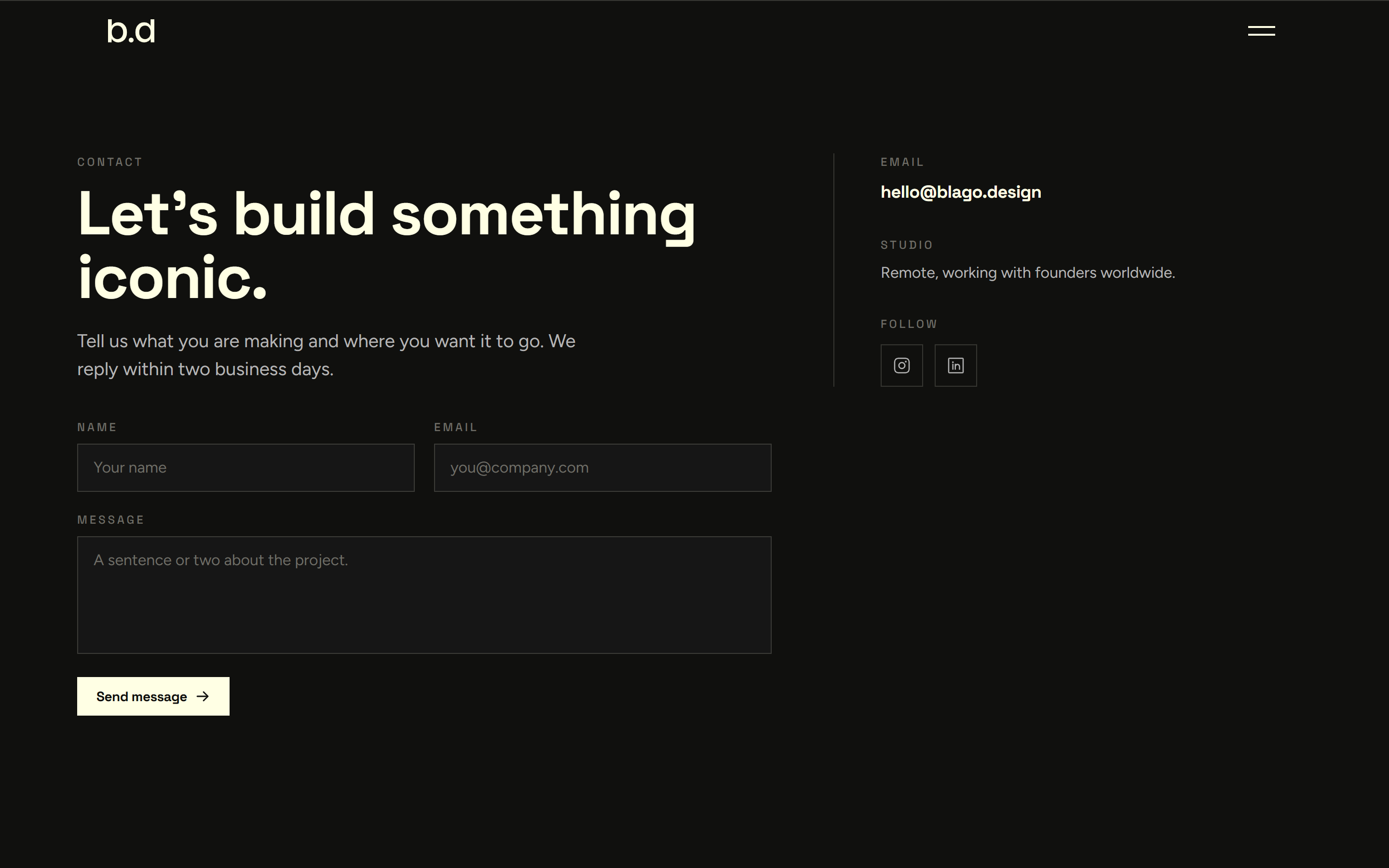
One clear way to start
Every path ends at one contact page: a plain form on the left, email and socials on the right. A floating Let us talk button follows you the whole way there.
Design system
The system behind the site
Every surface reads from one set of tokens. Change five values and the whole site rebrands. Cards, buttons, and labels are built once and reused everywhere.
Buttons
Card
Every surface
Card, border glow
Deliverable chips
Space Grotesk caps
Tracked label
Tokens
Aa
Grotesk + Figtree
Type pairing
Under the hood
Built quiet, built to last
The deck runs on Next.js and React with TypeScript, styled with Tailwind. GSAP drives the deck and every scrubbed animation. A lighter motion library handles the discrete things, the menu, the FAQ, the hero text. Phosphor draws the icons, and the light rays run in WebGL. Two fonts, no more.
The whole look reads from one set of tokens, so five values rebrand the site. Heavy motion sits behind a reduced-motion check, and every panel renders its finished state in the markup first, so nothing ever flashes half-built. Visible focus rings, real fallbacks, and a production build that ships every page as static. The route transition is a quiet dip to black and back, nothing louder.
In the end
A site that reads like the work.
Name, identity, voice, system, and site, shipped as one piece. It says what we do by being what we do, quiet, fast, and sure of itself. That is the bar we bring to every brand we build.